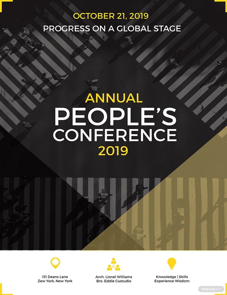
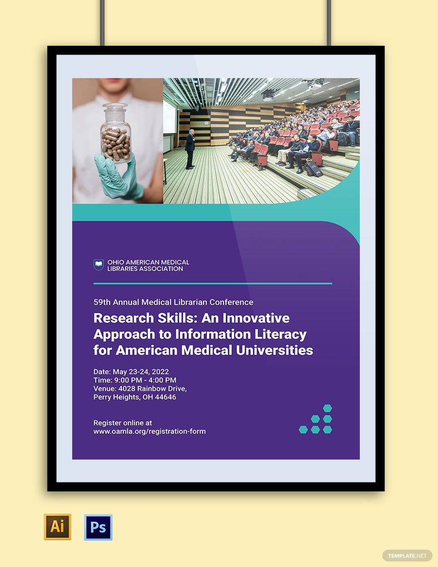
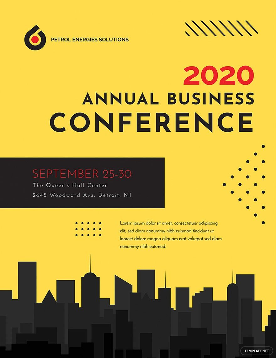
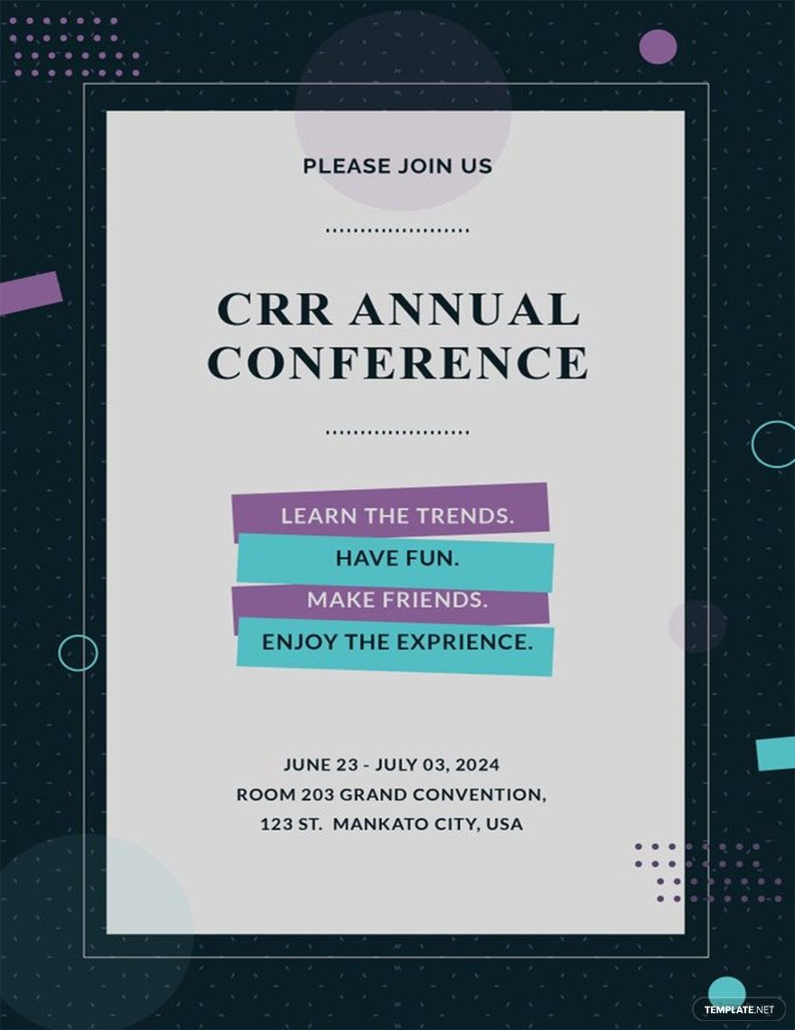
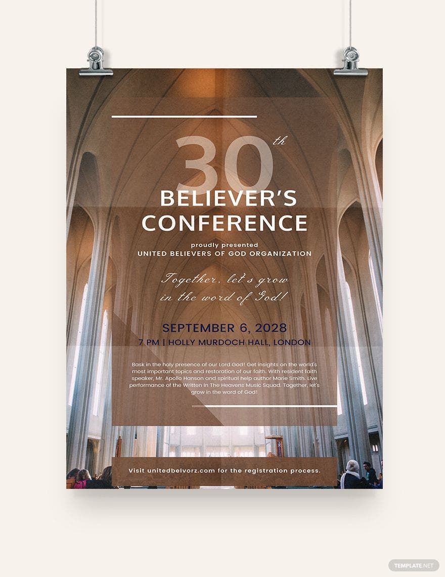
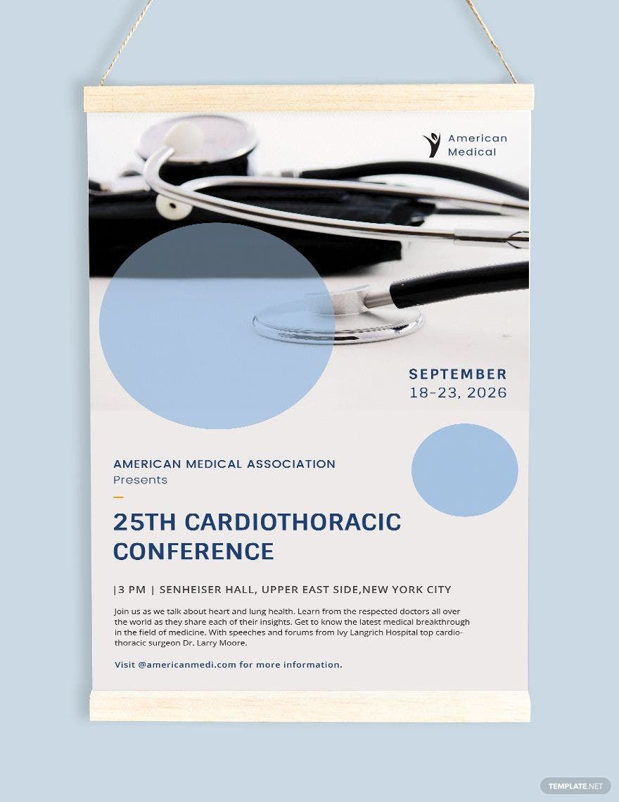
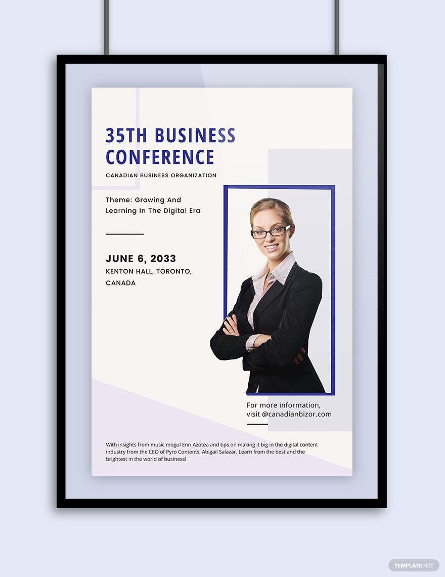
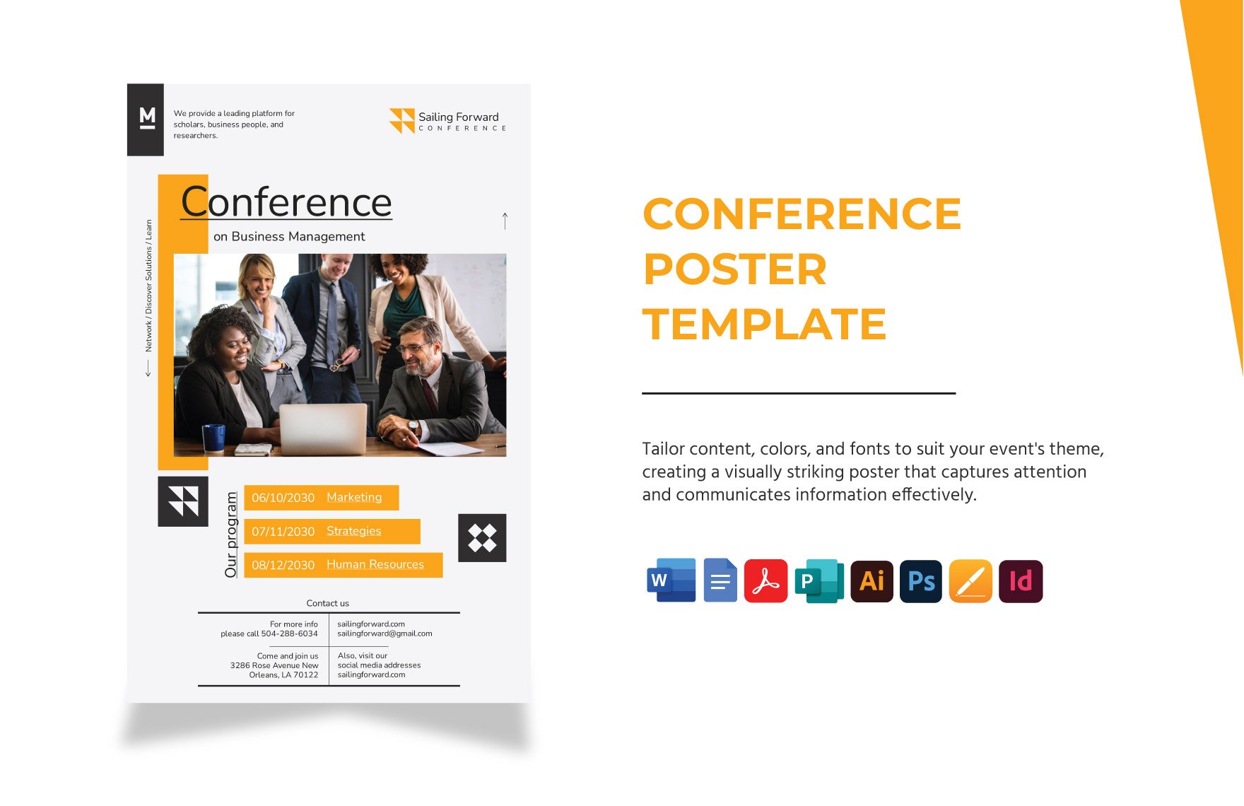
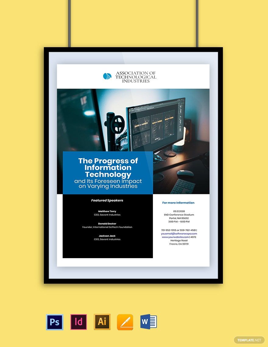
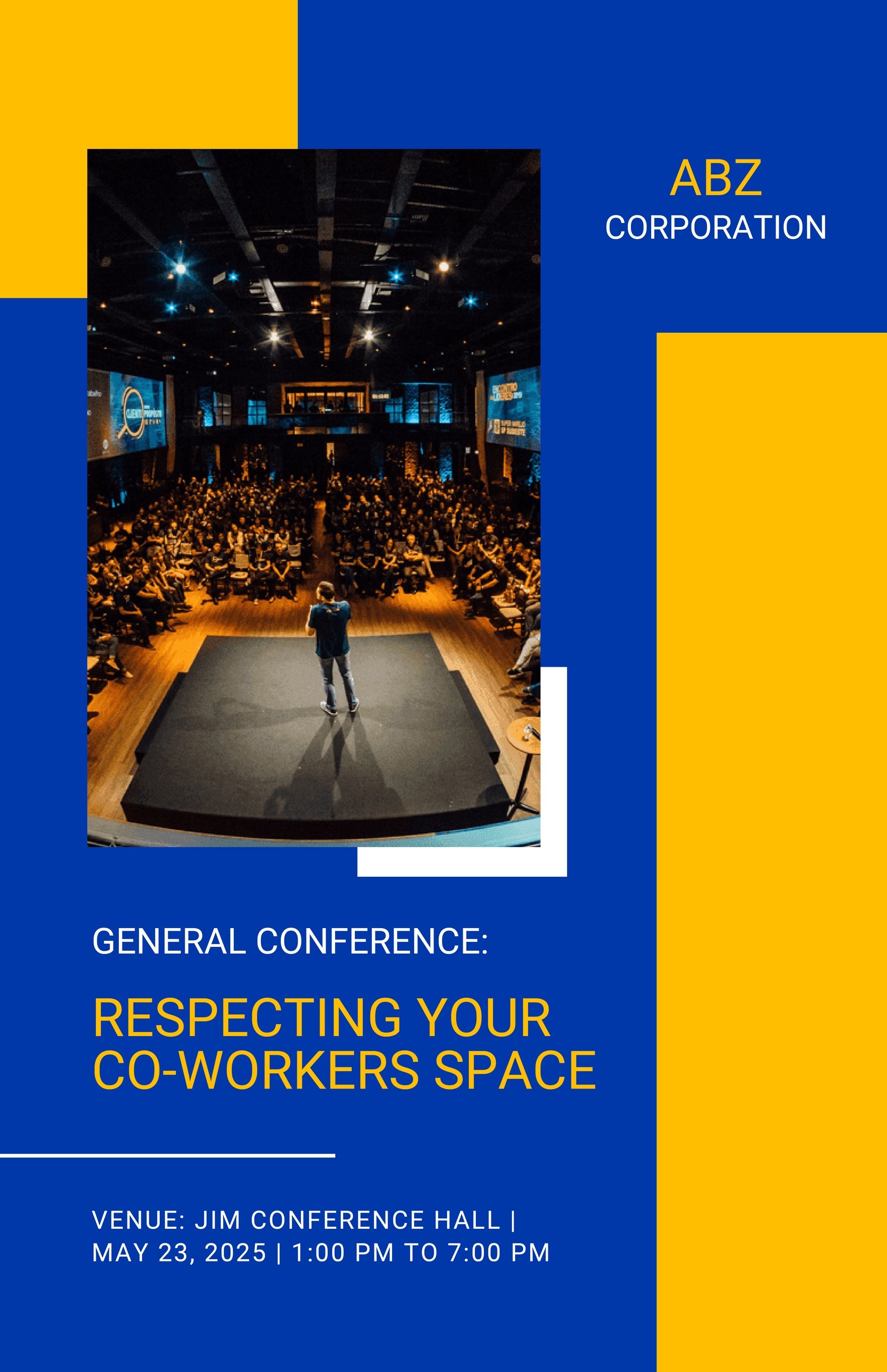
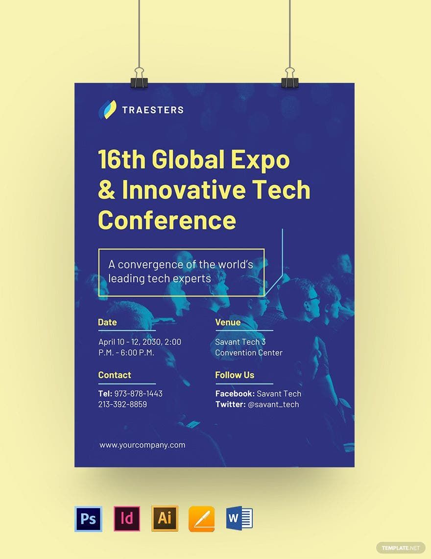
To promote a conference event is to earn the trust and interest of your particular target audience. If you need the help to establish your conference event’s credibility, sincerity, and integrity in the industry, particularly for your poster needs, our Free Ready-Made Conference Posters in PSD will be your secret weapon! Promote them accordingly (and quickly) with these user-friendly and editable poster templates. Primarily, all are pre-equipped by our creative experts with relevant and well-researched elements for your convenience. Personalize your poster, in a vertical or horizontal format, depending on your preferences! Make this yours in no time so you can inform, persuade, and invite your target guests with ease now!
Conference Poster Templates in PSD
Explore professionally designed conference poster templates in PSD. Customizable and printable for a professional touch. Download now!
Ignite Your Conference Promotions with Eye-Catching Conference Poster Templates in Adobe PhotoShop by Template.net
Elevate your event marketing with stunning Conference Poster Templates by Template.net, designed in Adobe PhotoShop to captivate your audience. Create impactful, professional-grade posters quickly and effortlessly, ideal for event organizers and marketers looking to impress without needing any design experience. Whether you're aiming to promote a high-profile business conference or launch an inspiring academic symposium, our templates have you covered. Our offering includes free pre-designed options, along with downloadable and printable files in the versatile Adobe PhotoShop format. Experience the ease of enhancing your outreach today with our beautiful pre-designed layouts, free of design hassle, yet full of creative potential.
Explore a world of creativity with our extensive range of Conference Poster Templates in Adobe PhotoShop. Discover a variety of free and premium templates that are regularly updated to reflect the latest trends in design. Choose and customize these visually striking templates to suit your brand’s aesthetic, then download or share them digitally for maximum exposure. Enhance your promotional strategy with our flexible options; mix and match between pre-designed templates to create a unique marketing vision. Enjoy the freedom to download or share via link, print, email, or export, ensuring your promotions get the reach they deserve. Dive into our library today and experience the perfect blend of elegance and efficiency.
