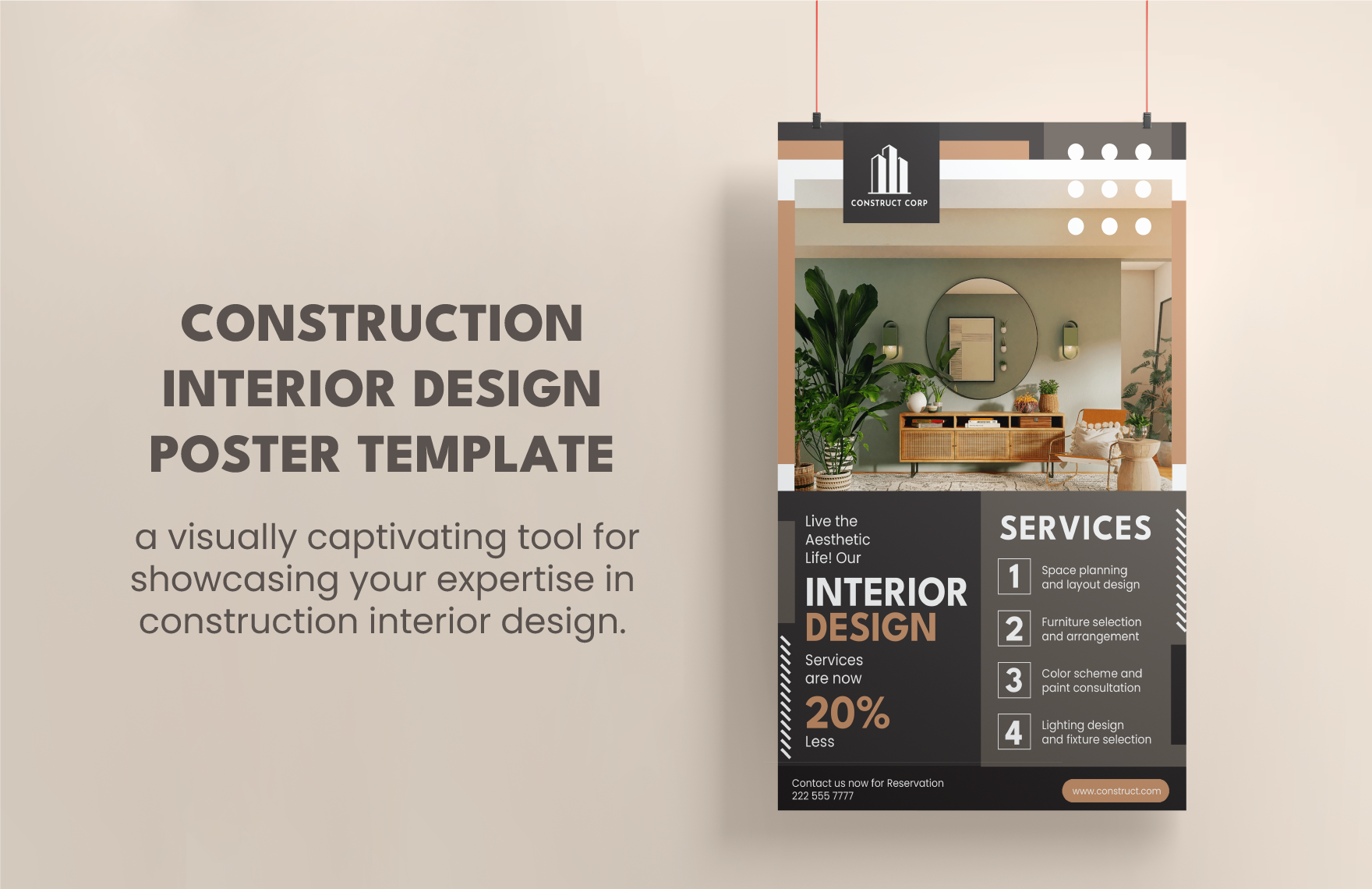
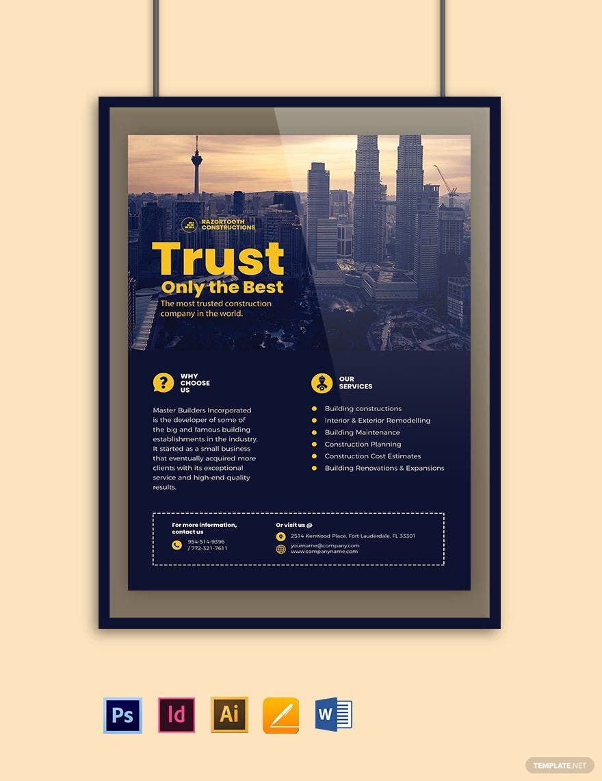
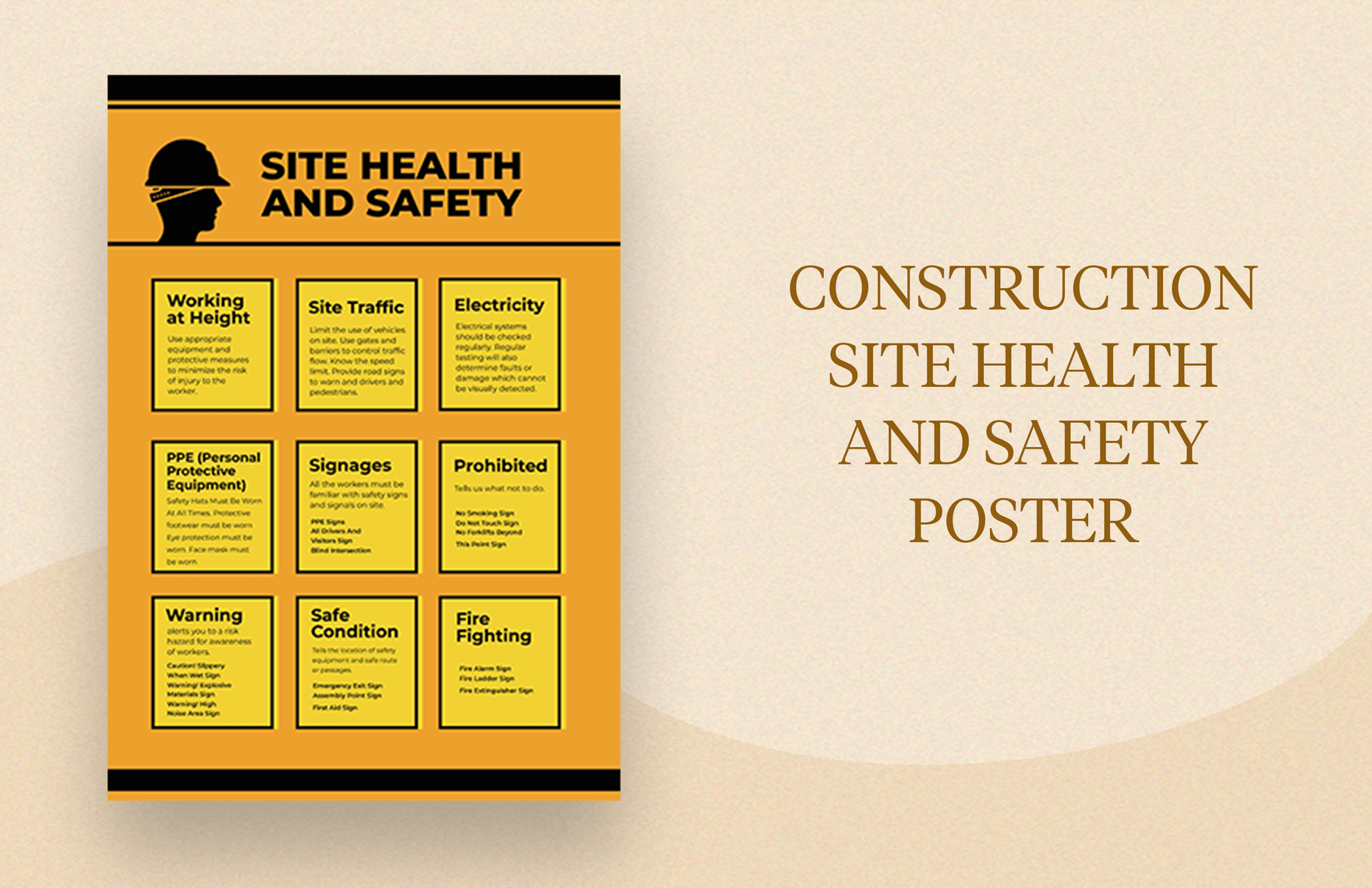
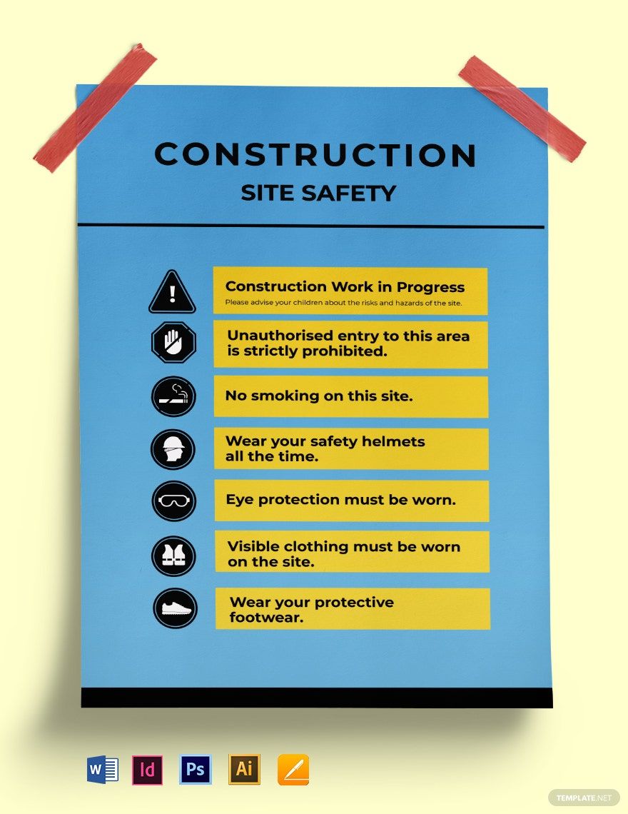
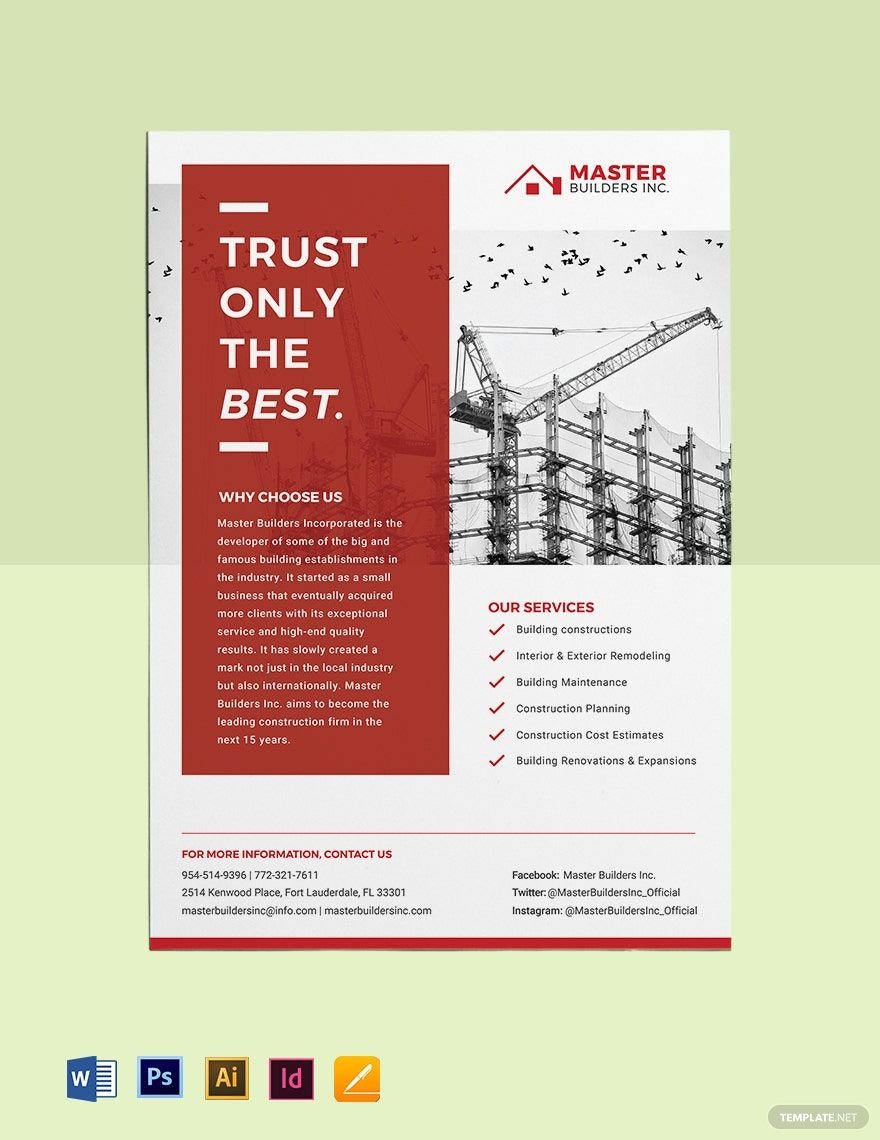
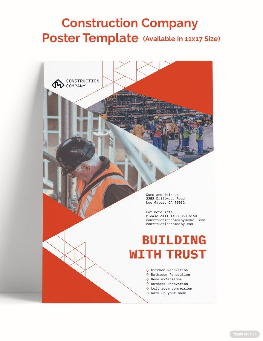
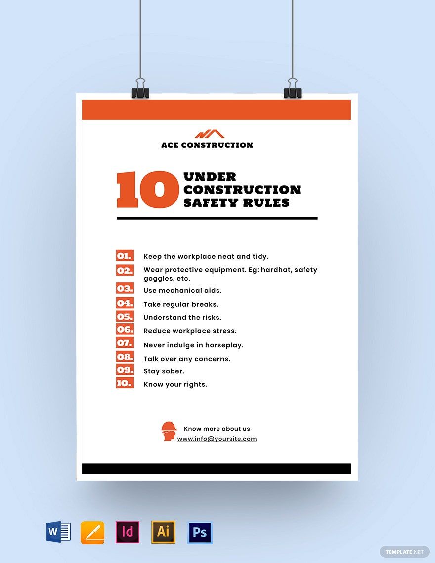
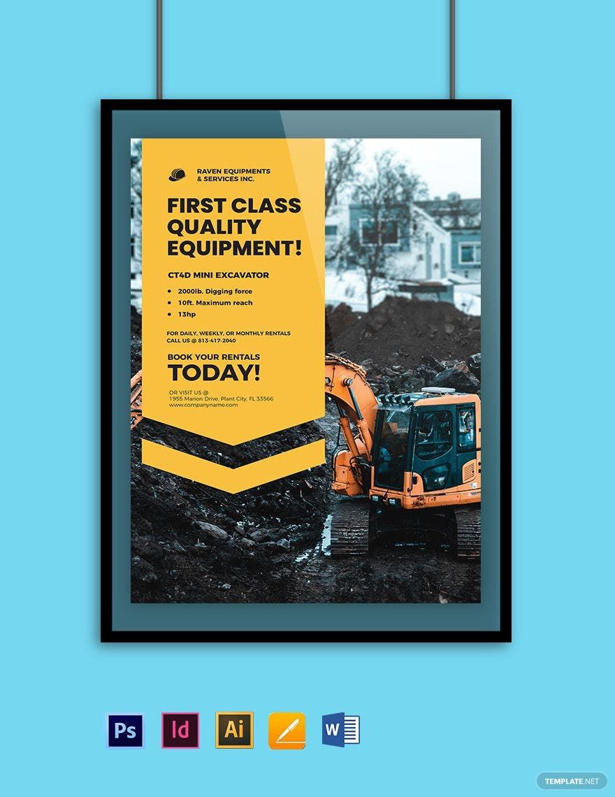
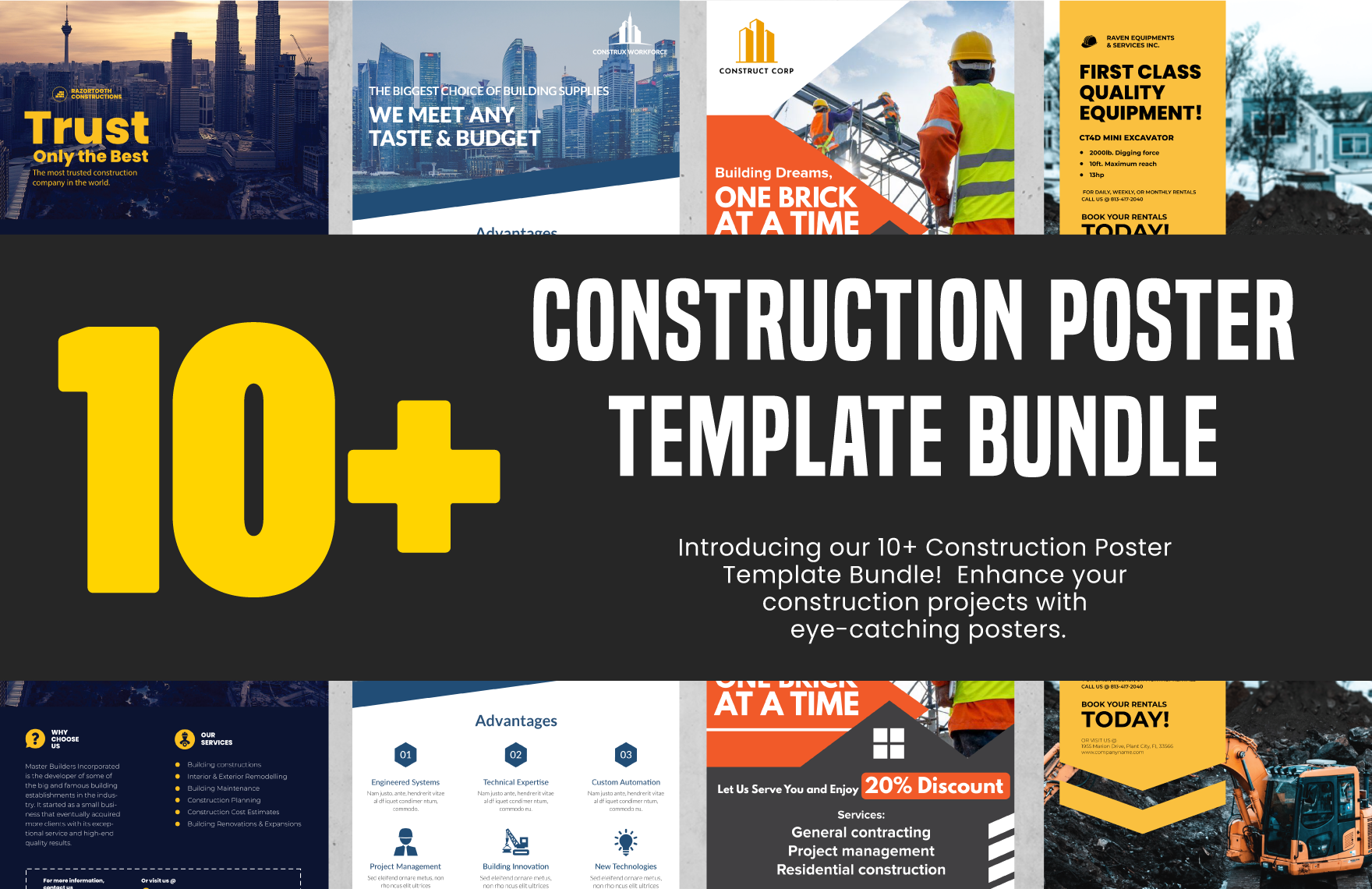
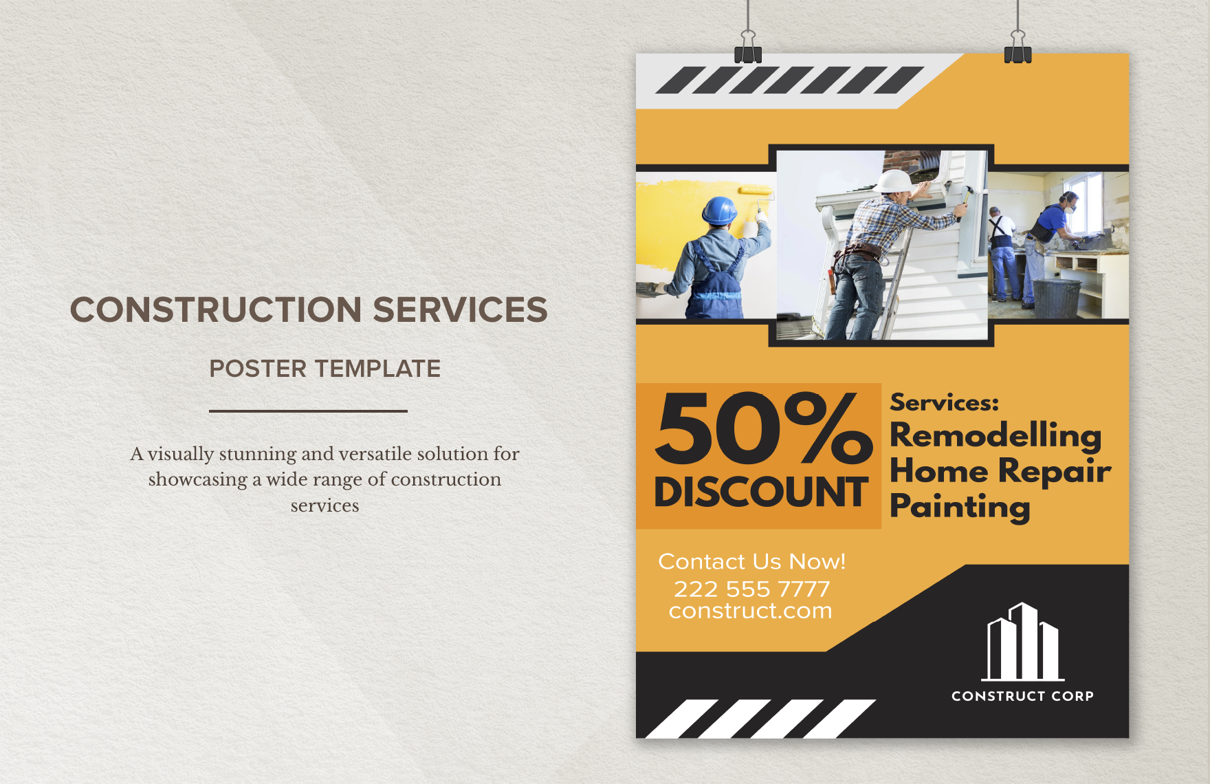
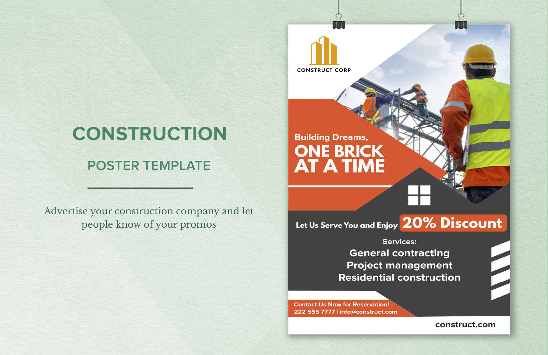
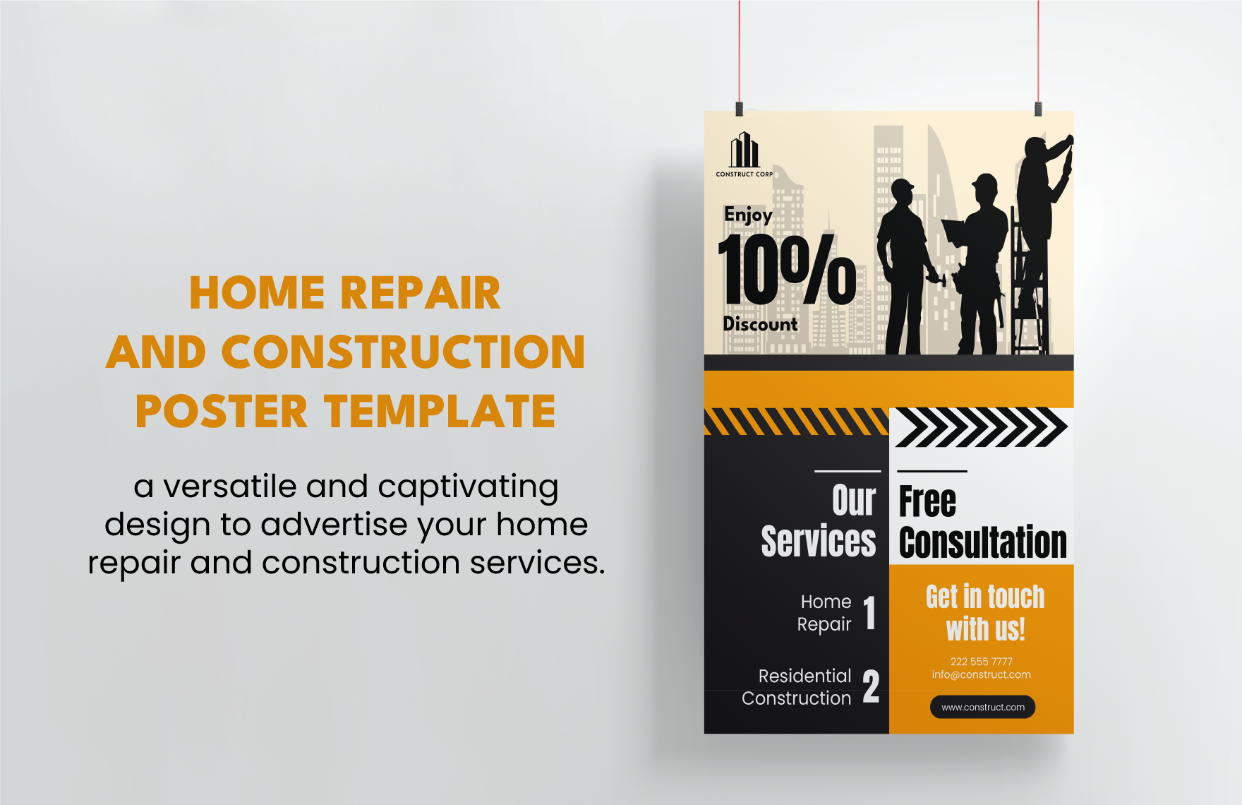
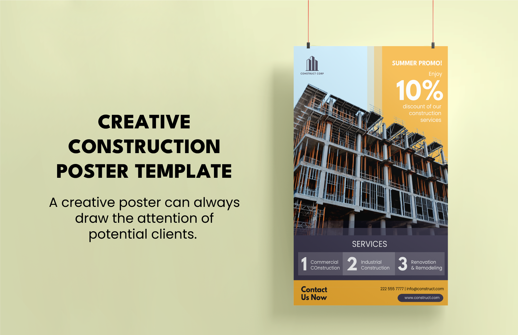
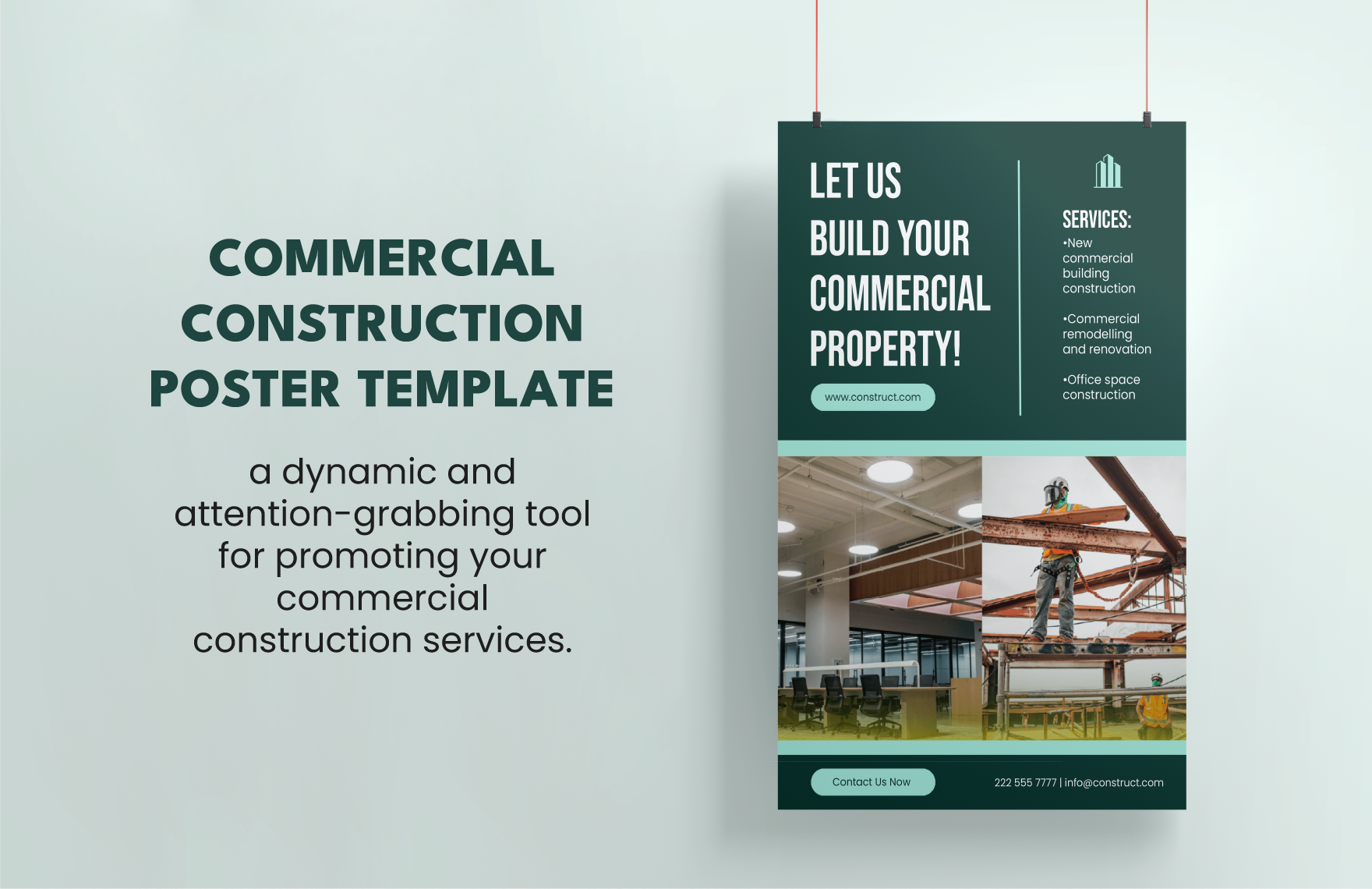
Construction businesses are on the rise. They are one of the essential industries in the market. With them, buildings, houses, and other establishments are created. But, each construction company has to strive to promote itself. So, if you're one of them, let us help you with advertising. Here is an array of high-quality Ready-Made Construction Posters in PSD. These are printable, easily editable, and 100% customizable in Adobe Photoshop. These are available in A3 Sizes. Use Photoshop's unique features of multi-layering and color-channeling to make the best construction posters in town. Download one of these templates and promote and disseminate important construction information!
How to Make a Construction Poster in PSD?
Statista said that a sum of 992 billion dollars was expected from private construction spending in 2018. This shows that the Construction Industry is in demand. However, every construction company has to advertise and promote their business effectively. For this, there are a lot of routes that companies can use to advertise. And one of the ways for that is through using construction posters. Also, posters aren't only for advertisement, because you can also use them for announcements, for educational purposes, and more. So, for whatever purpose of your poster may have, here are some construction poster ideas and tips that can help you make one:
1. Pick Legible Typographies
A poster's text has to be readable. If you put typographies that are hard to read, there's a tendency that the people will have a hard time understanding the content of your simple poster. Also, you have to be careful about the typography of your choice. Make sure that they will fit the purpose of your poster. Don't use a lot of typographies in one poster. This can ruin the look of your poster. You can limit your typography use into three. Remember the rules for creating Construction Flyers and Brochures as well.
2. Use Colors
People will become more interested if you apply colors to your poster design. You have to choose the colors of your modern poster carefully. Colors can add attractiveness to your poster if you use it correctly. Another thing, make sure that the color of your text is going to be visible even with the background. This way, the people who are going to read the construction poster are going to have an easier time.
3. Put Images
Pictures are essential to a poster. A poster can become more attractive to people if you put images on it. Select the pictures that suit the Construction Project type. For example, you're making a scaffolding Construction Safety poster, then you can put a picture of a scaffold. Don't paste photos that have nothing to do with what the poster is about. Also, don't forget to add an image with high-quality to make your printable poster look better.
4. Organize Everything
The arrangement of the poster's content is essential. You have to organize it in a way that people can easily read and understand it. You can highlight the vital information of your sample poster so that it gets the attention of people. People read from top to bottom or from left to right. So, you have to make sure that you arrange the content either way.
5. Download a Construction Poster Template
If you're too busy to make a poster from square one, don't worry. You can try downloading a construction poster template. A template is going to help you save time and will cause less hassle for you. So, you can pick the template that you need from above. Every template layout is beautifully designed by artists to make your poster stand out. After that, you can customize the template in Adobe Photoshop. Lastly, you can now print your poster and post it.