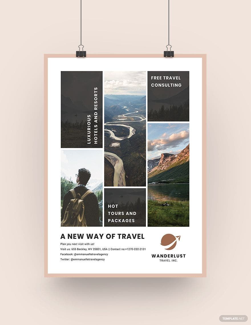
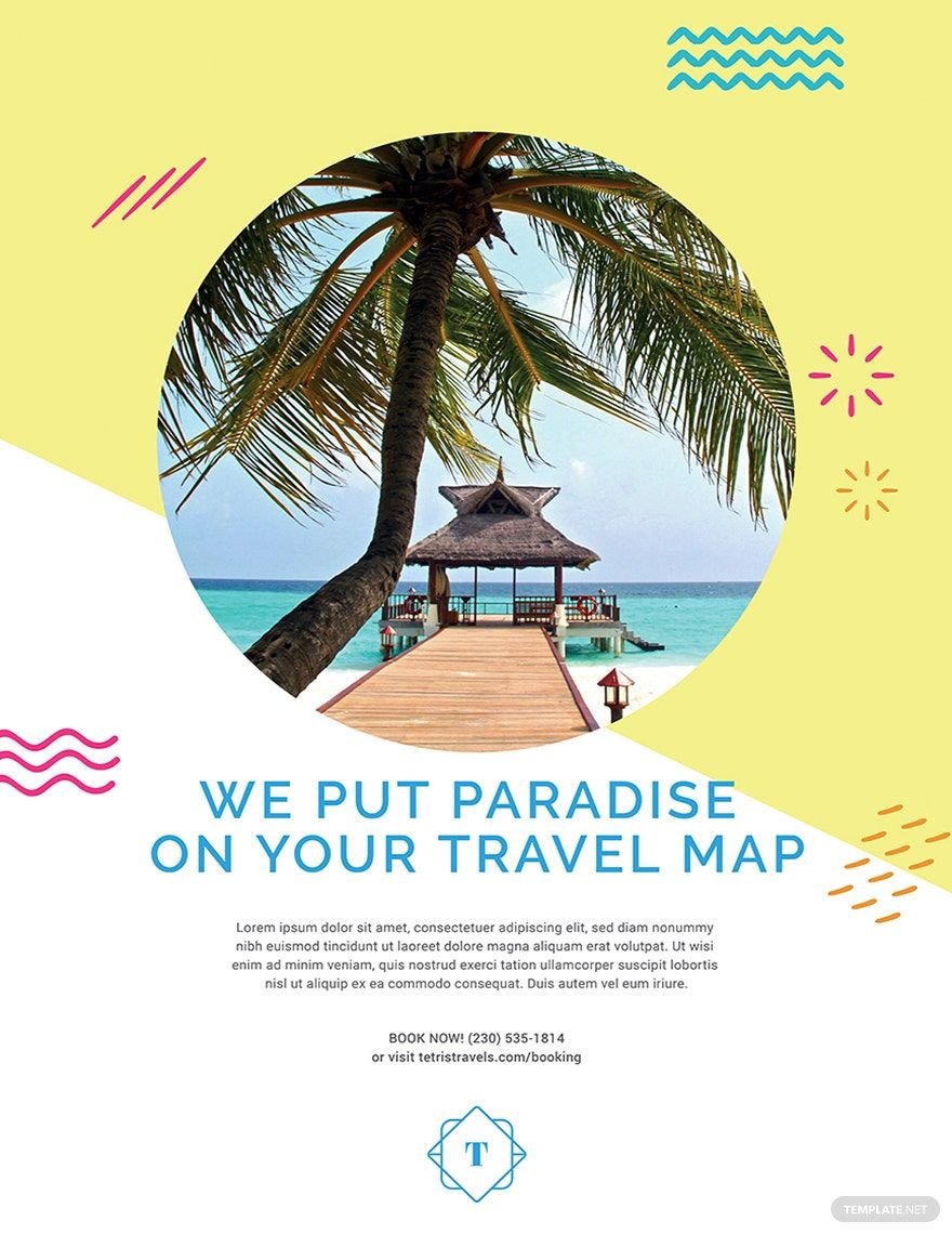
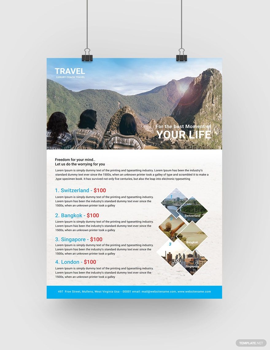
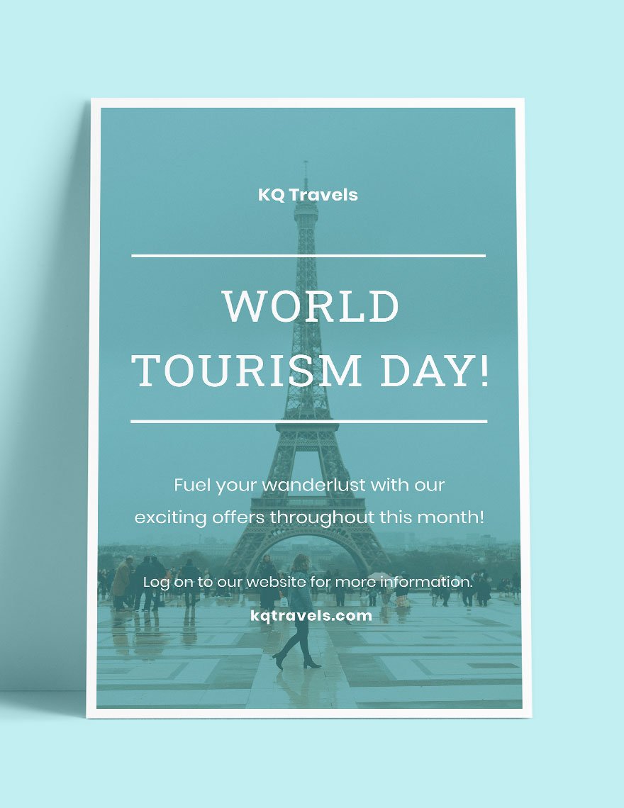
There's nothing more fulfilling than being able to visit the different countries of the world. Hence, the growing number of tourists and backpackers. But with tons of travel agencies popping all over the place, getting more clients to book with your travel company is not easy. For that, we present to you our professionally-made and high-quality Travel Posters in Illustrator in Illustrator, which you can use to send the word out about your travel business, and entice clients to choose your company instead of your competitors. Get these in 11x16 or (A3) 11x17 inches + Bleed sizes. Earn more clients today by downloading our travel poster templates now!
Travel Poster Templates in Illustrator
Create your own travel poster templates in Illustrator with our customizable and professional designs. Download now!
Bring your event promotions to life with pre-designed Travel Poster Templates in Adobe Illustrator by Template.net
Create professional-grade travel posters quickly and easily with no design experience, thanks to Template.net's amazing collection of pre-designed Travel Poster Templates. Ideal for travel agencies or personal projects, these templates help you showcase exotic destinations or promote travel events with flair and precision. You'll find a variety of free templates ready for download, all crafted to perfection and existing as downloadable and printable files in Adobe Illustrator. These templates make it simple to create eye-catching designs without the hassle or cost of hiring a designer. Enjoy beautiful, pre-designed templates that take the stress out of your projects, all while saving you time and money.
Explore more beautiful pre-designed Travel Poster Templates in Adobe Illustrator; our collection is constantly updated to include new and creative designs. With options to download or share via link, print, or email, their reach is only limited by your imagination. Embrace the flexibility of both free and premium templates for a variety of styles and needs. Discover the full potential of these templates by mixing and matching their elements to suit your project. Let Template.net be your go-to source for travel poster inspiration, offering you a seamless design experience that transforms your visions into reality.
