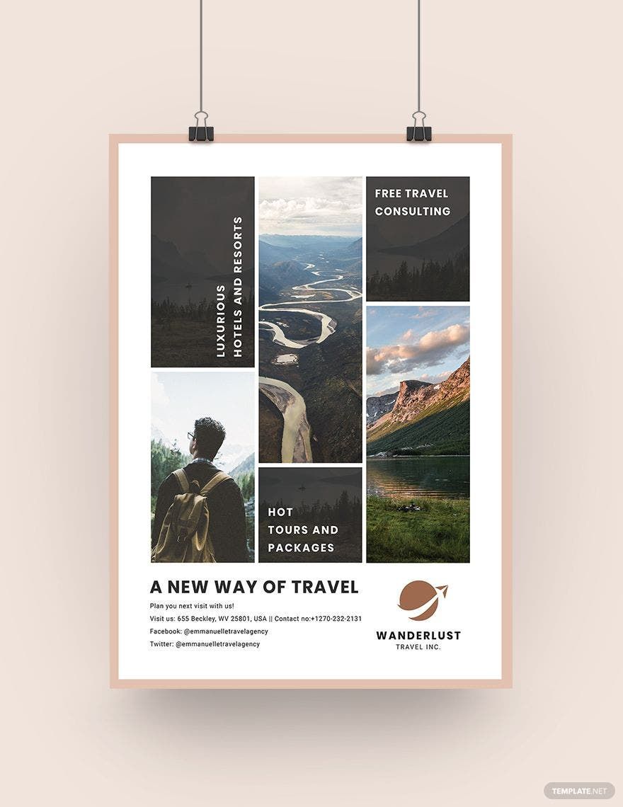
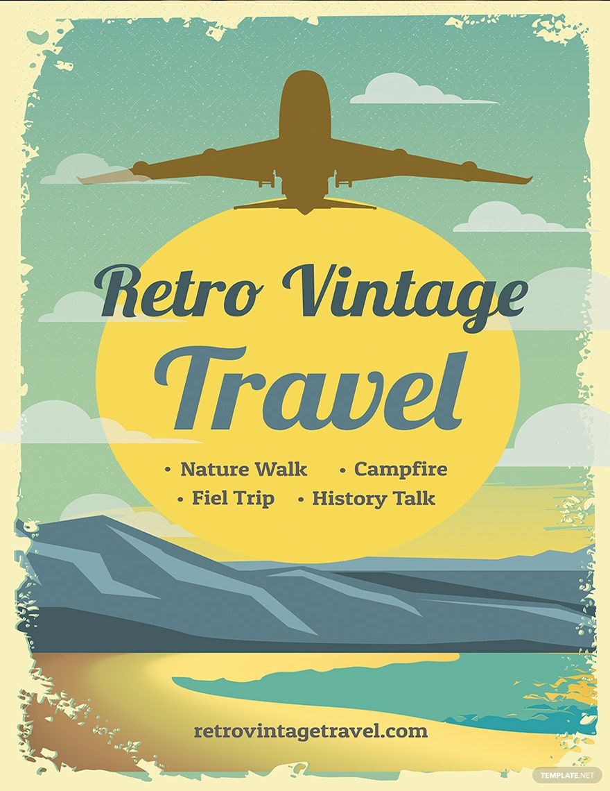
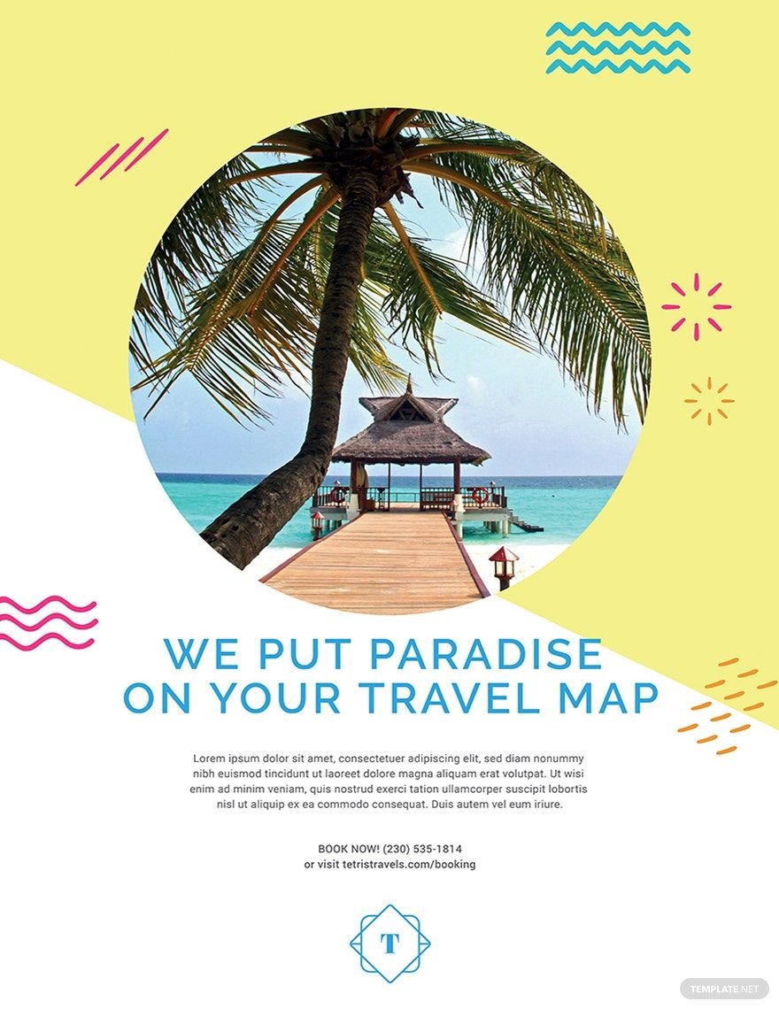
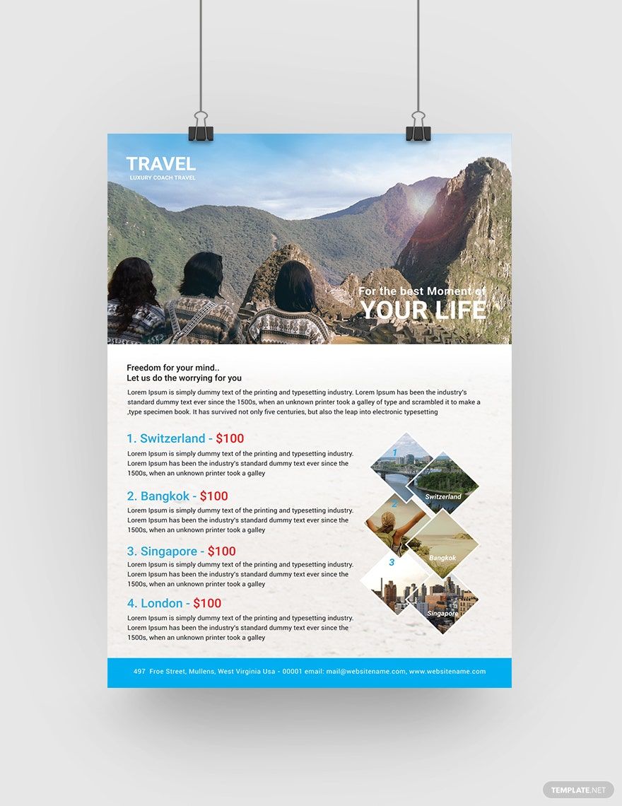
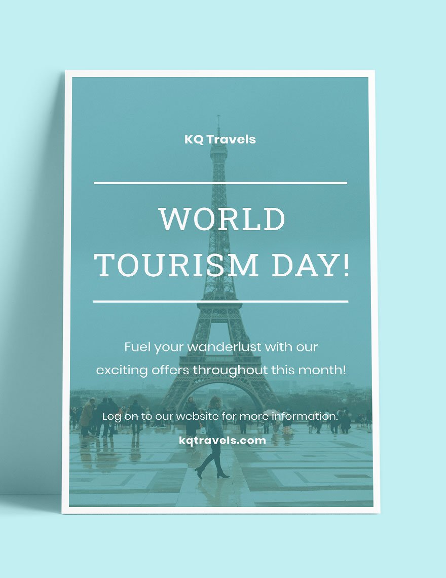
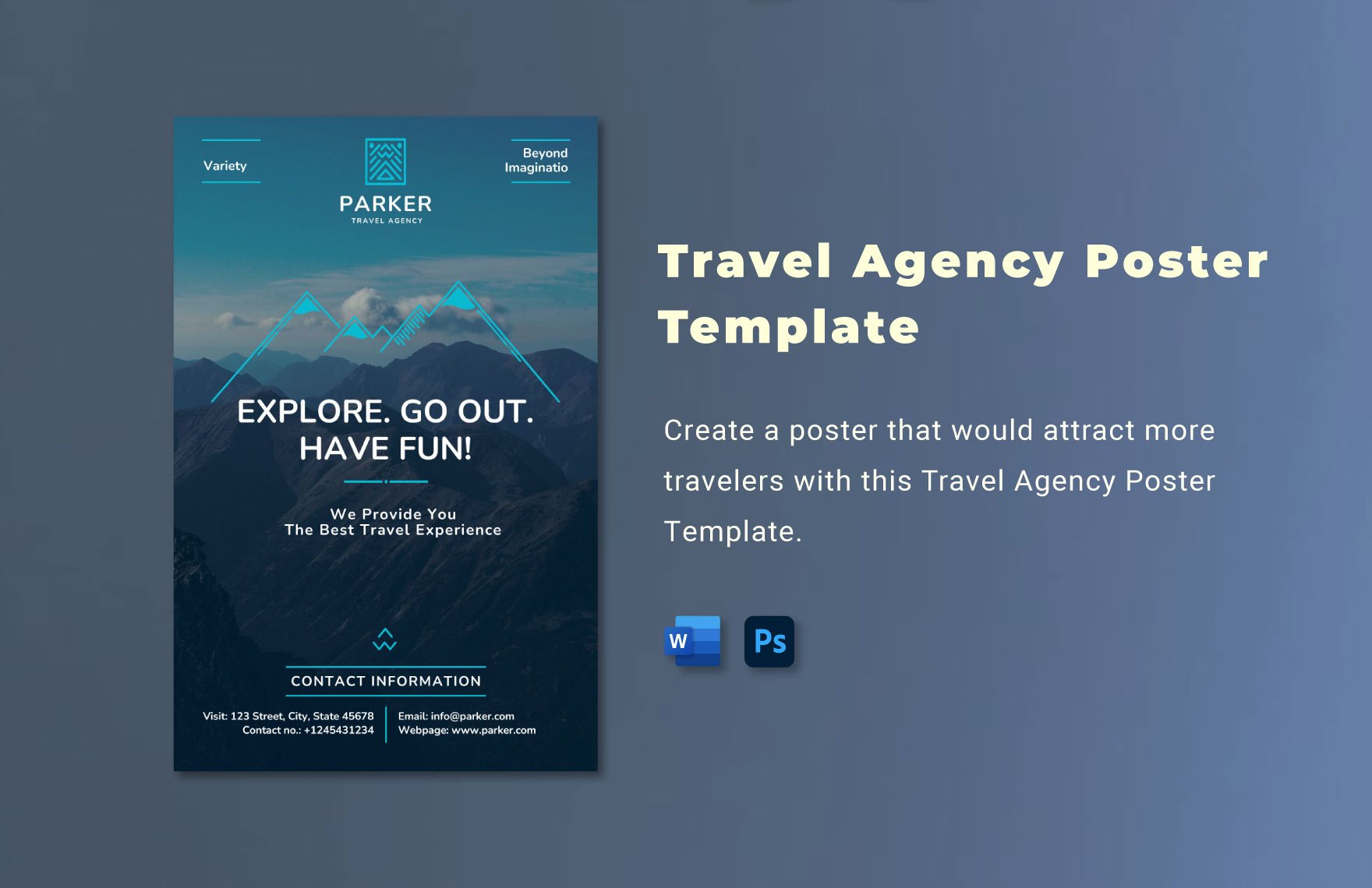
Traveling brings a lot of good benefits to the human body. They are part of every people's leisure that helps them overcome the stress and tension that they feel inside. Now that it has become one of the major demands and needs of the human body, more travel agencies would likely take advantage of it by offering different travel promos. Stand out from the rest of the competition with the help of our beautifully designed Travel Posters in PSD. All of them are downloadable and editable in Adobe Photoshop file extension. The best thing about these templates is that all of them are printable in (A3) 11x17 inches + Bleed size. Generate more profit for your business with the help of this template! Download now!
Travel Poster Templates in PSD
Explore professionally designed travel poster templates in PSD. Customizable and printable with professional quality. Download now!
Transform Your Designs with Stunning Travel Poster Templates by Template.net
Elevate your adventure promotion efforts with pre-designed Travel Poster Templates in Adobe PhotoShop by Template.net. Perfect for travel agencies and creative marketers, our templates allow you to craft eye-catching posters effortlessly, even if you have no design experience. Use them to showcase destinations or promote special travel offers. Enjoy the convenience of free pre-designed templates, alongside downloadable and printable files in Adobe PhotoShop format. With customizable layouts and beautiful pre-designed elements, you save time and resources while achieving stunning results for both print and digital distribution.
Explore an expansive array of Travel Poster Templates to find the perfect match for your next project. Our library is frequently updated with fresh and vibrant designs, ensuring your marketing campaign is both current and compelling. Download your chosen template and share it with ease, whether through email or as a print-ready file, to maximize your reach. Experiment with both free and premium options for a versatile and flexible approach to your promotional strategy. Unlock your creative potential and make a lasting impression with skillfully crafted posters tailored to your unique travel experiences.
