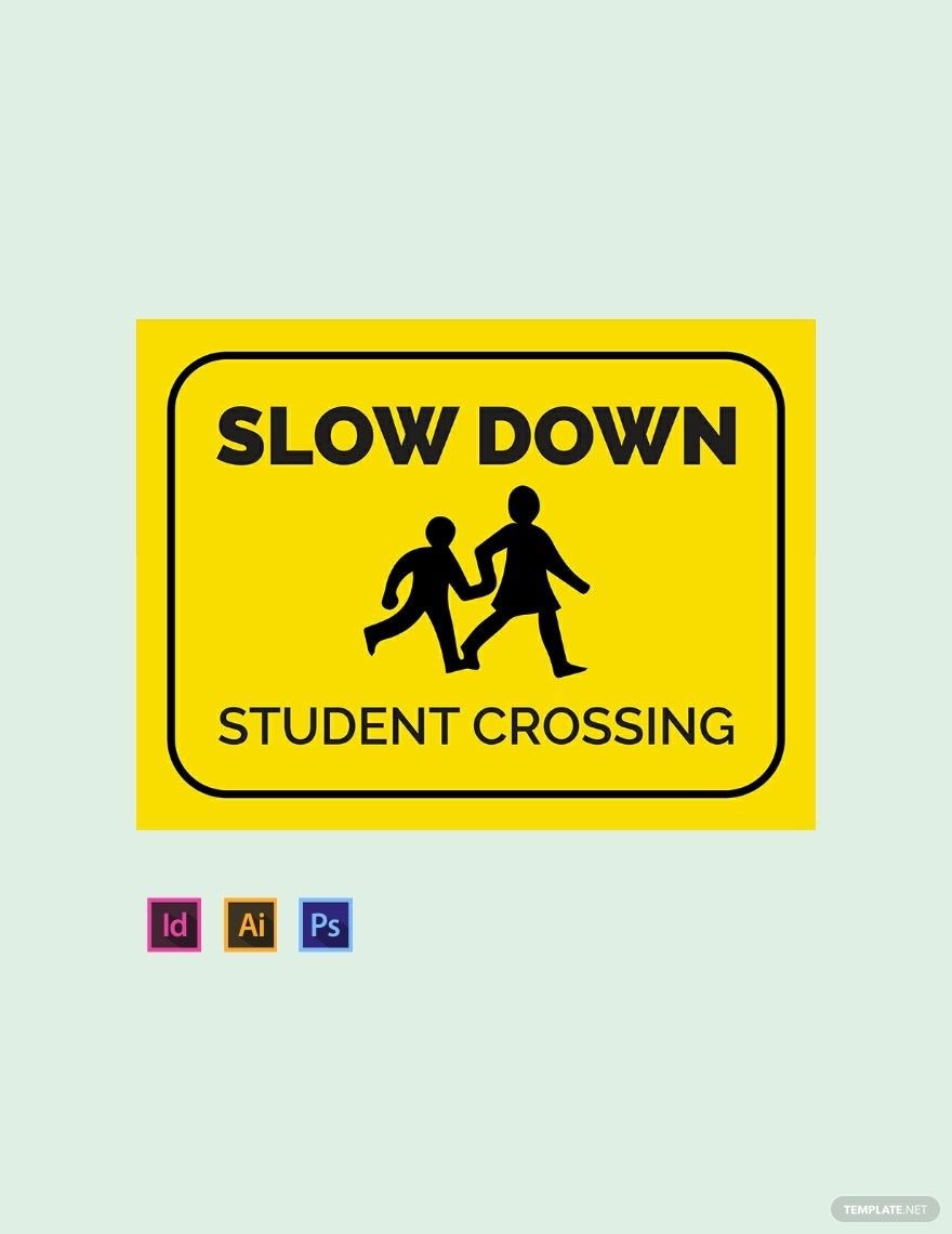
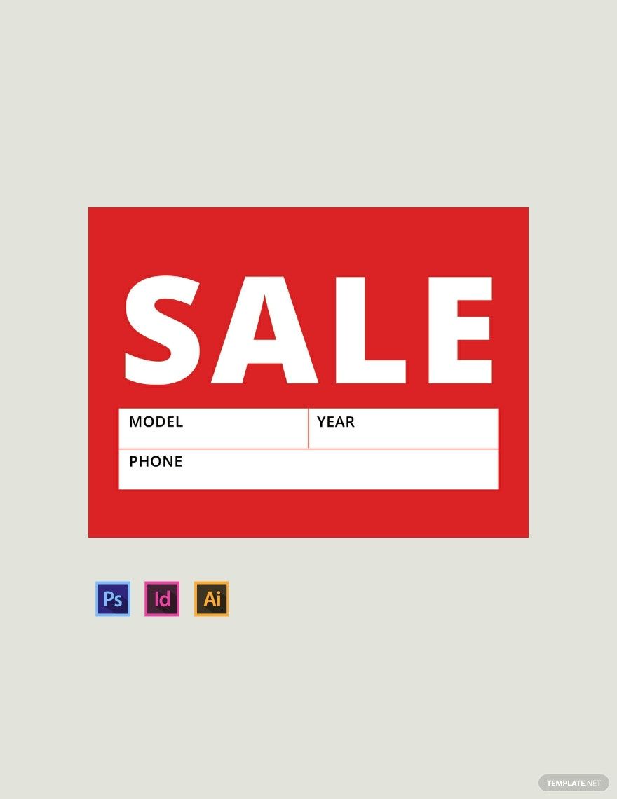
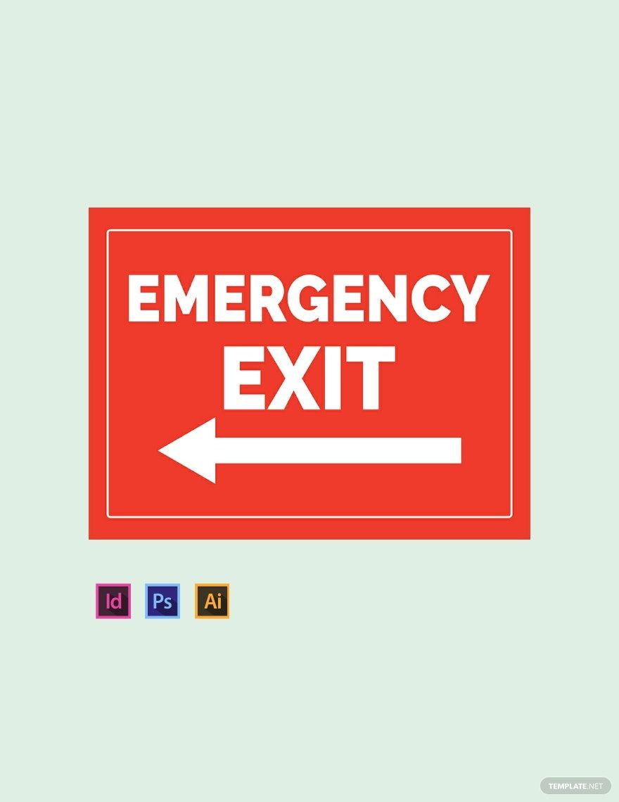
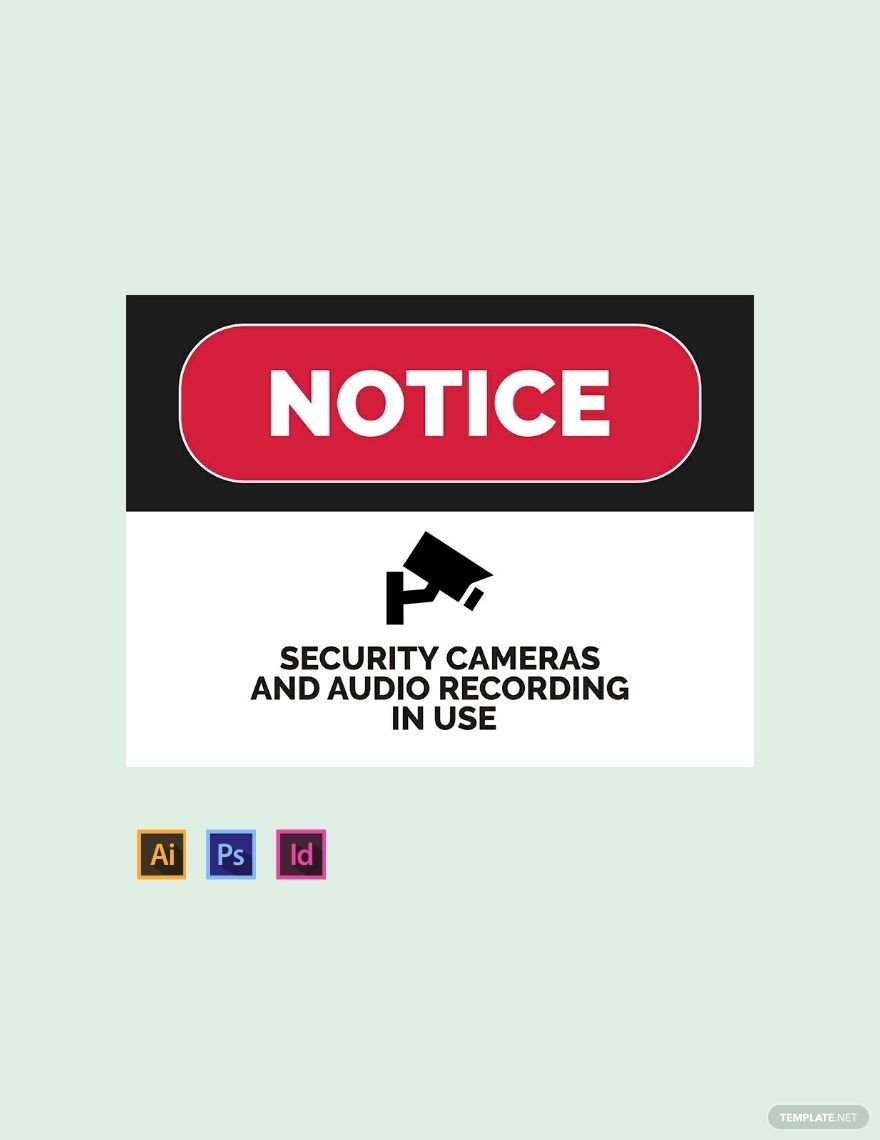
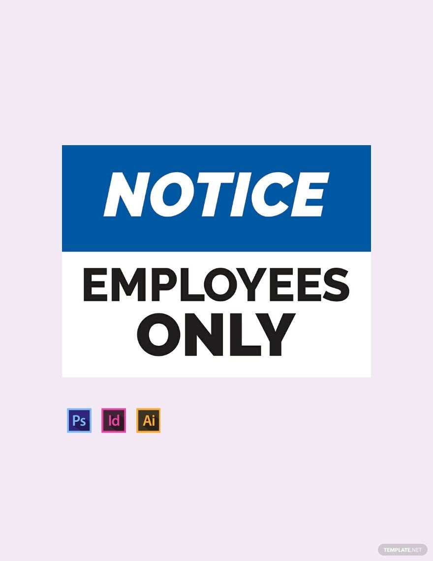
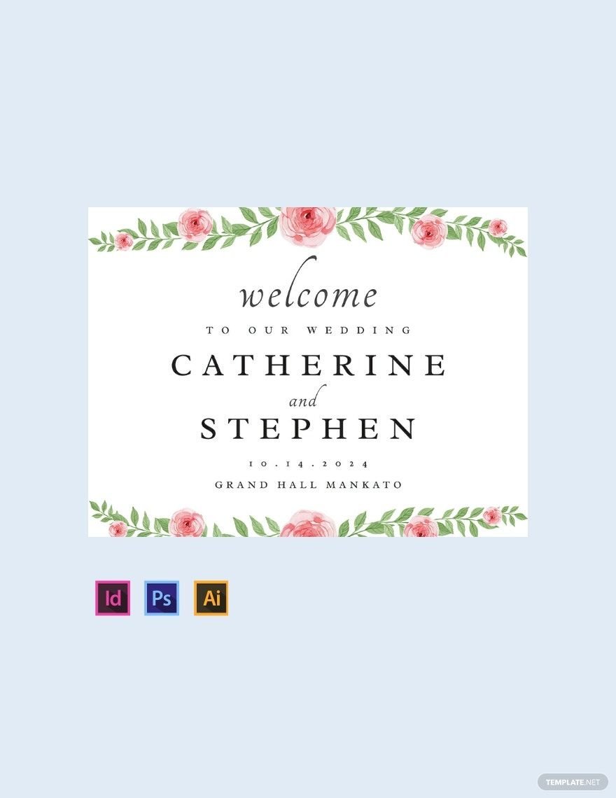
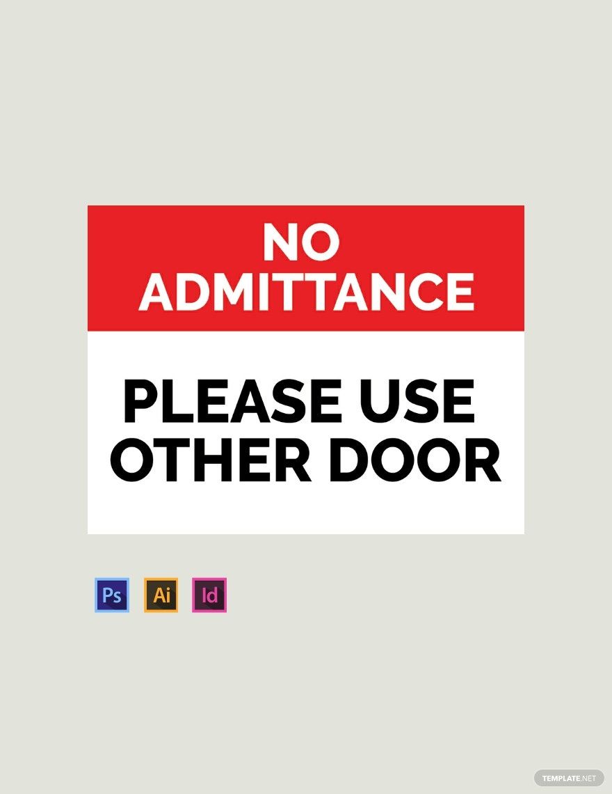
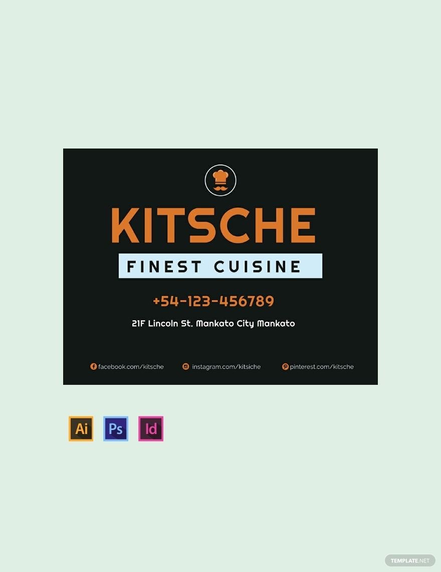
Get to craft an effective sign for your establishment using one of our premium sign templates. These ready-made files are printable and can be download instantly anytime, anywhere, at any device. These signs are usually displayed or posted for public view and function as a type of notice students, employees, or passersby to see. Use our templates to create signs you can post such as a workplace sign, warehouse sign, security sign, school sign, safety sign, real estate sign, a sale sign, holiday sign, and much more. These files are easily editable and professionally designed. Make use of high-quality content layout, artwork, images, standard text fonts, and graphic files. Ready-made and easy to use in all versions of Adobe InDesign.
Sign Templates in InDesign
Enhance Your Visual Communication with Versatile Sign Templates in Adobe InDesign by Template.net
Bring your event promotions to life with pre-designed Sign Templates in Adobe InDesign by Template.net. Design like a pro! Whether you're a small business owner or an event planner, these templates enable you to create professional-grade signage quickly and easily, without any design experience. Whether you’re looking to promote an event or showcase product features, these templates have you covered. Enjoy the flexibility of using beautiful pre-designed templates that come with fully downloadable and printable files in Adobe InDesign format. With these Free templates, you can effortlessly adjust customizable layouts to suit your specific needs for both print and digital distribution, ensuring you save time and effort while maximizing impact.
Discover the extensive library of Sign Templates that await your creative touch. Explore more beautiful premium pre-designed templates in Adobe InDesign, with new designs added regularly to keep your collection fresh and updated. Download or share your final designs via link, print, email, export, or other distribution methods for increased reach and engagement. Maximize your creativity and flexibility by utilizing both free and premium templates. This combination ensures that you will always have exactly what you need to create captivating signage for any occasion.
