Make Your Campus Communications Come to Life with University Sign Templates from Template.net
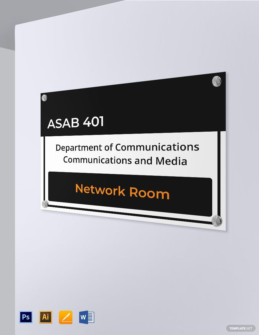
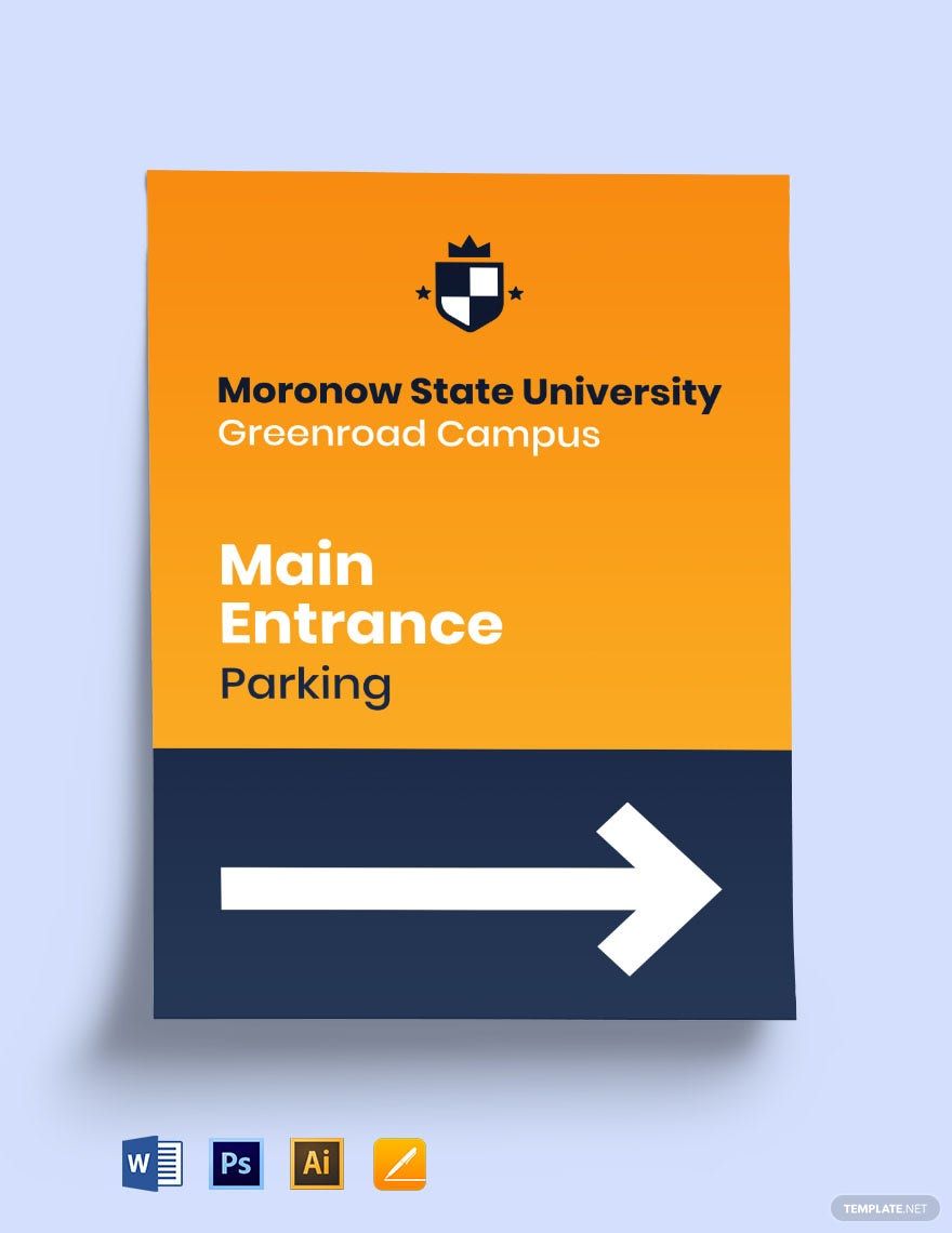
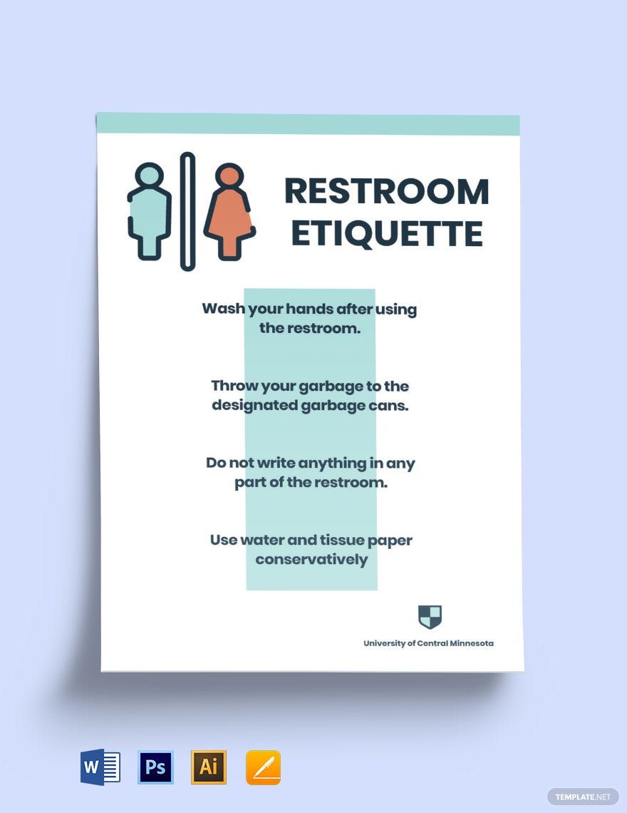
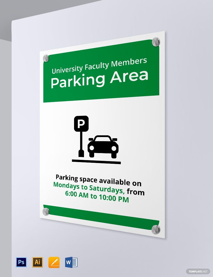
Keep your university administrators, event organizers, and student leaders engaged, informed, and on-brand with University Sign Templates from Template.net. Whether you’re planning to promote a campus event or provide clear directions during orientations, these professionally designed templates have got you covered. Effortlessly include essential details like time, date, and location to ensure your audience is always in the know. No design skills? No problem! With free, high-quality templates ready for digital or print distribution, you can maintain a professional appearance that resonates with your campus community.
Discover the many University Sign Templates we have on hand, ready to tailor to your needs. Select a layout that fits your purpose, swap in your university's logo, and tweak colors and fonts to match your school's branding. Enjoy advanced touches by dragging and dropping icons or graphics, adding vibrant visuals or animated effects, and utilizing AI-powered text tools. The possibilities are endless and entirely skill-free, making it fun and effortless for anyone to create impactful communication materials. With regularly updated templates, there's always something fresh to explore. When you’re finished, download or share your designs via link, email, or print for convenient distribution across multiple channels.

