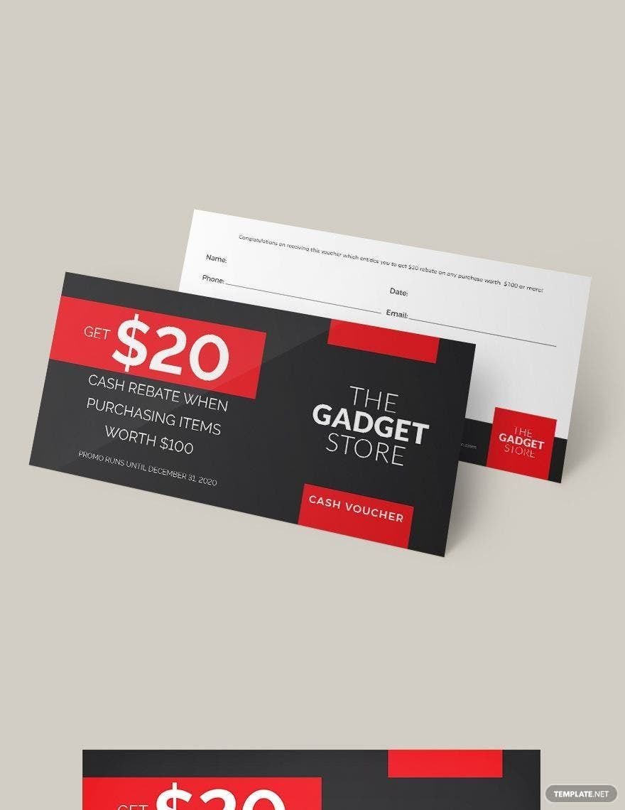
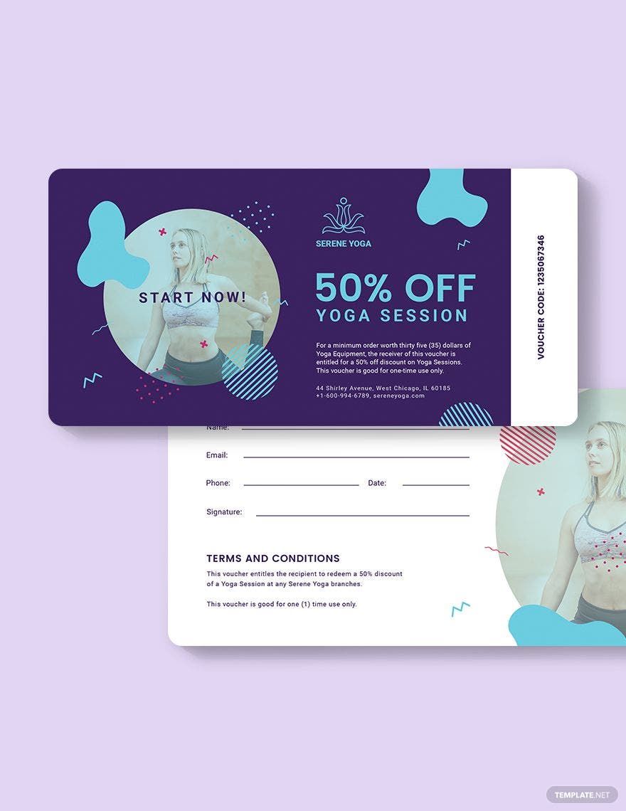
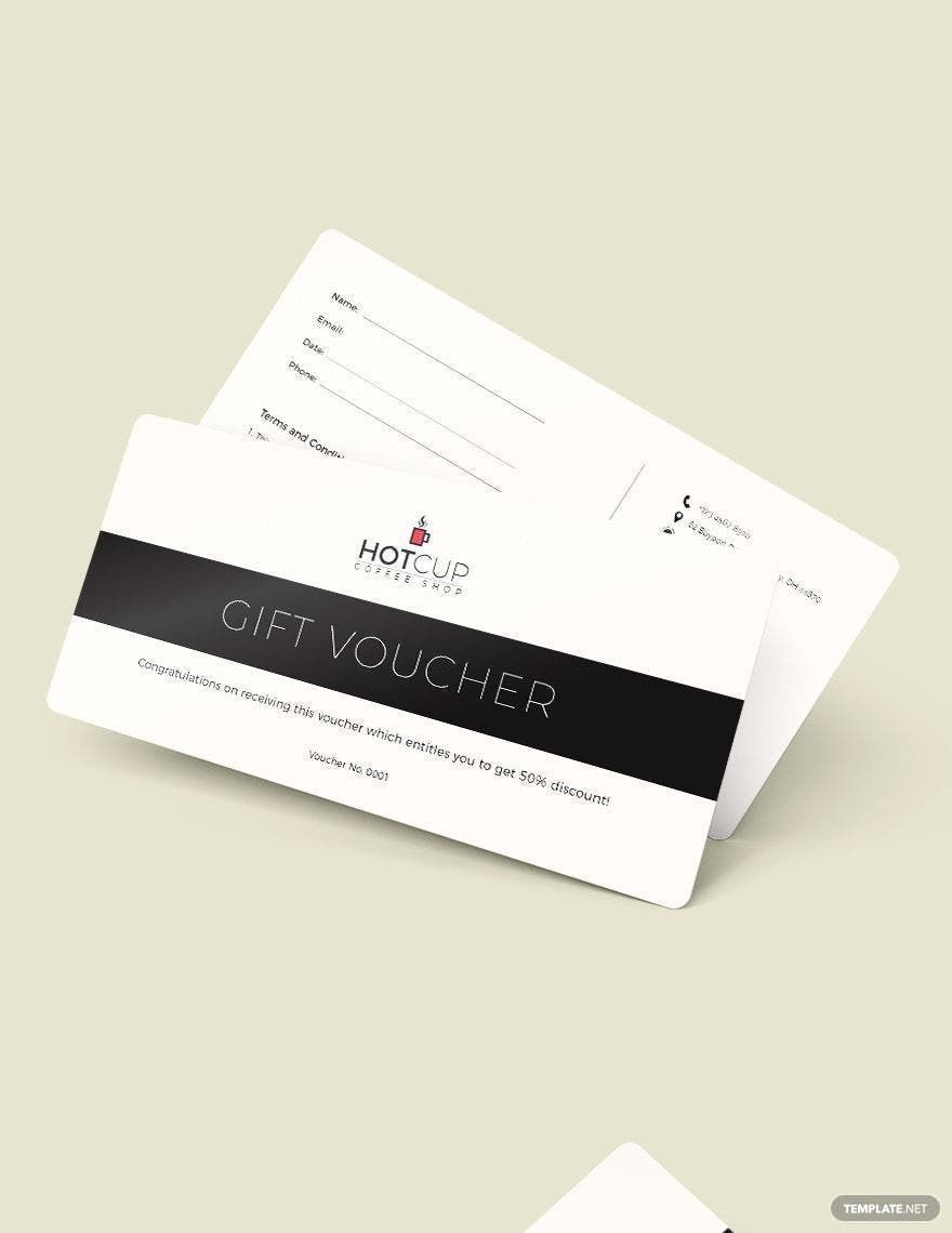
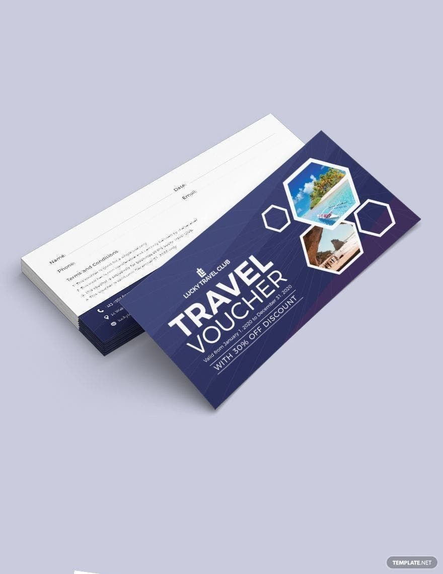
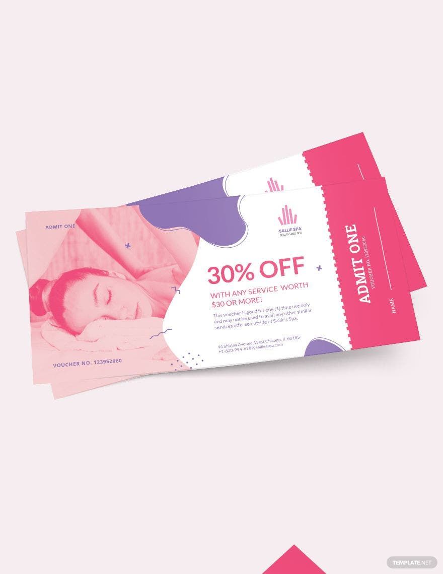
Bring your Promotions to Life with Simple Voucher Templates from Template.net
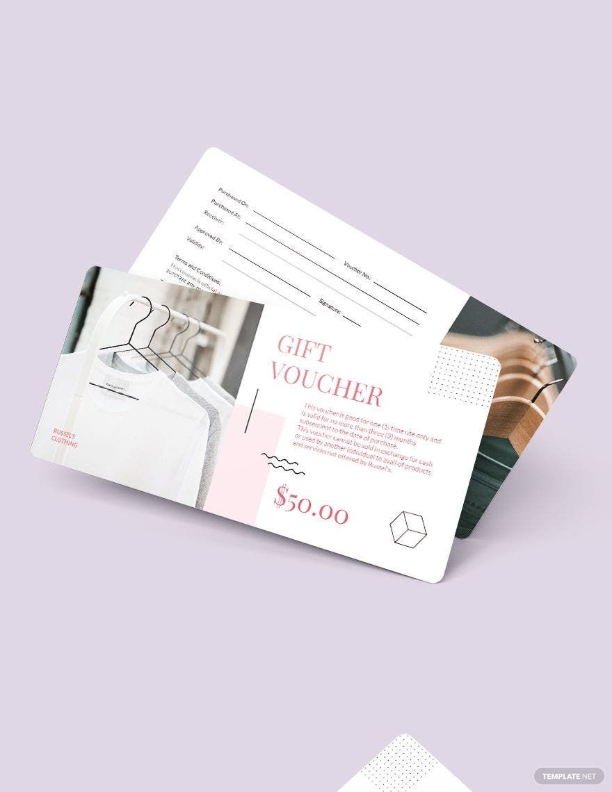
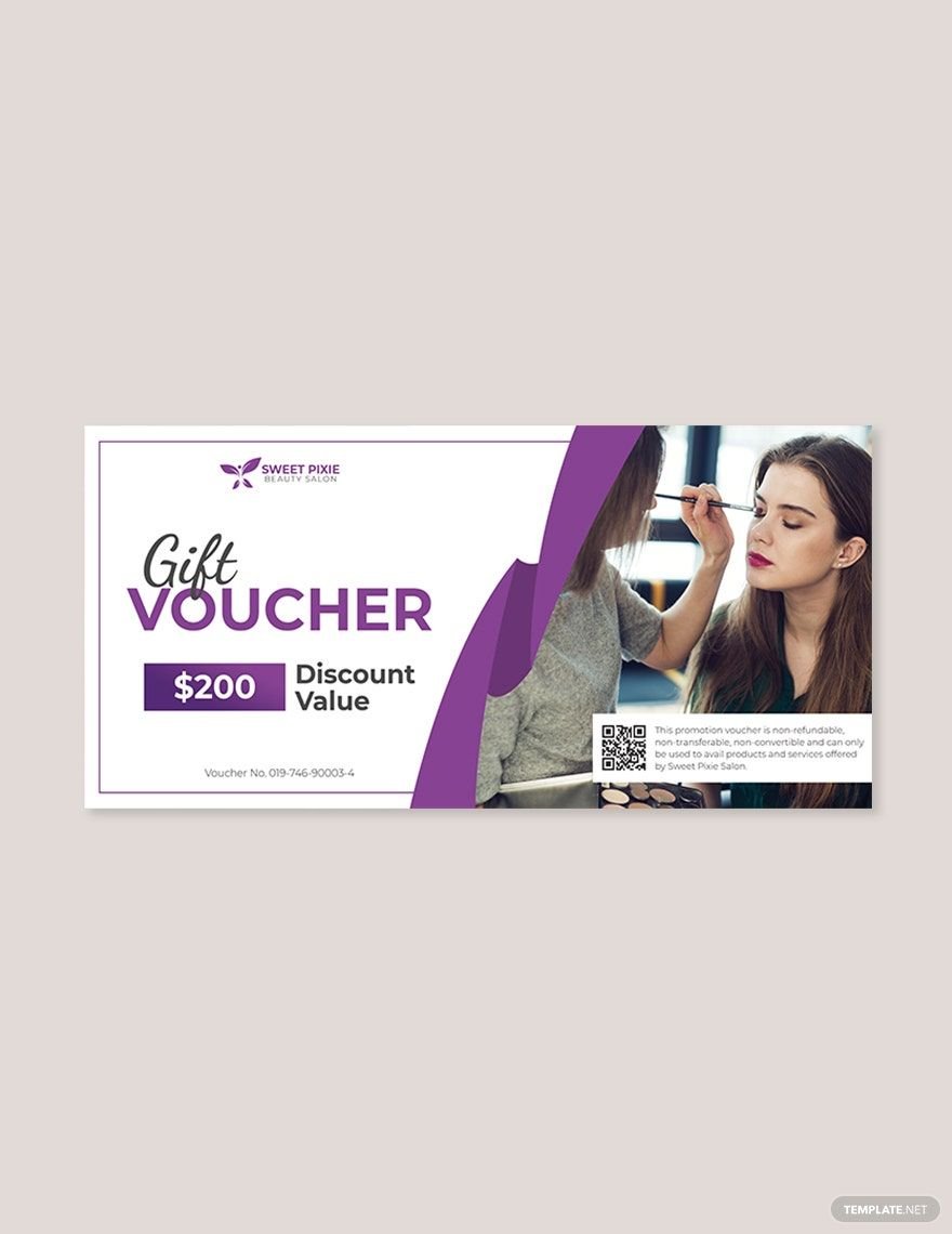
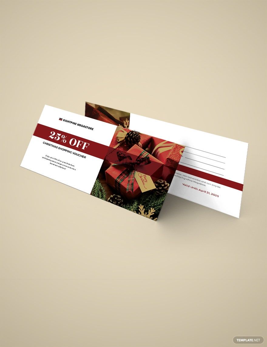
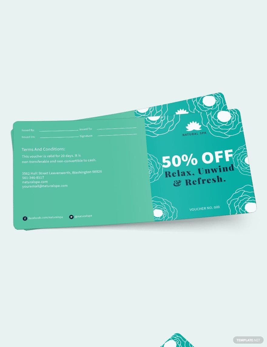
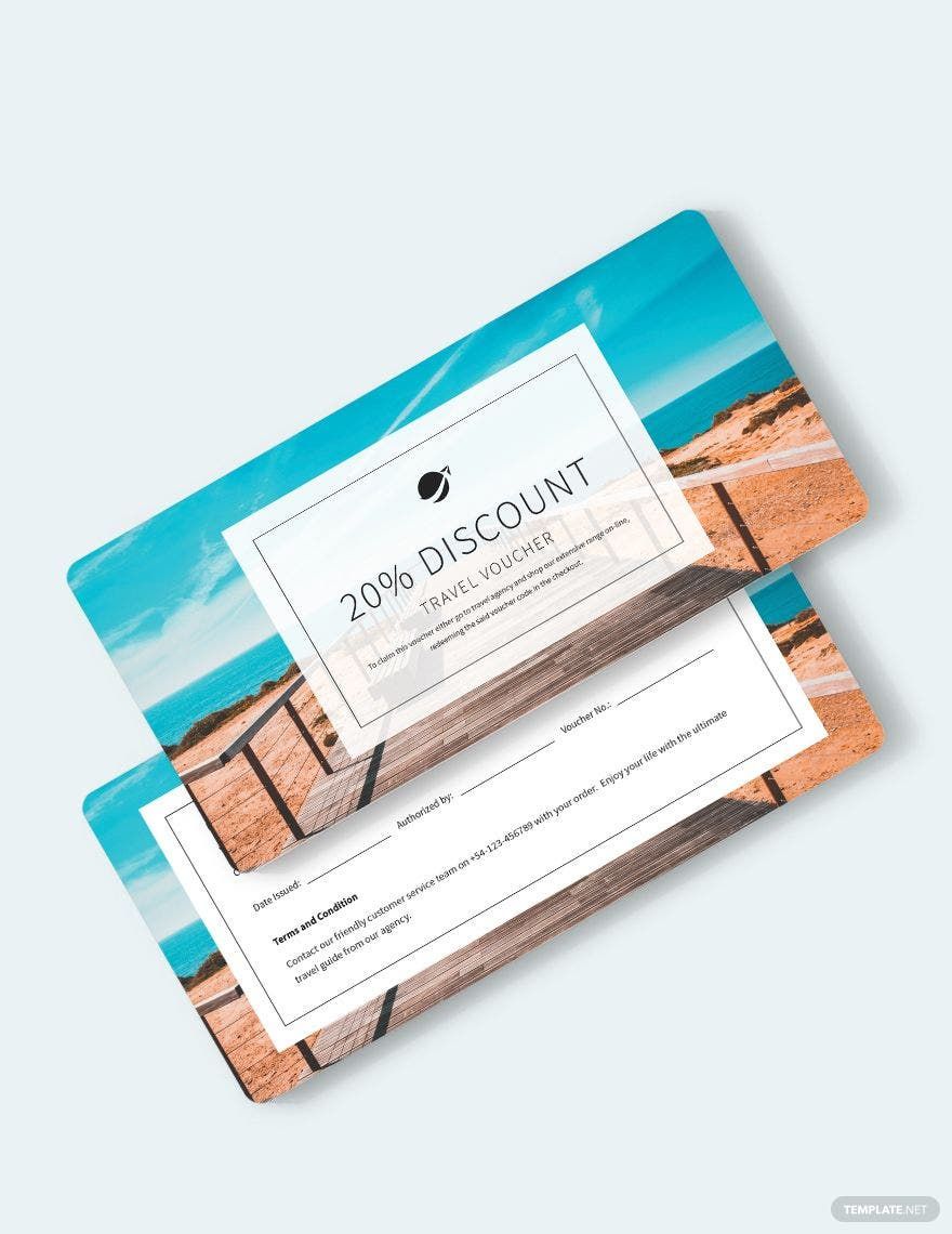
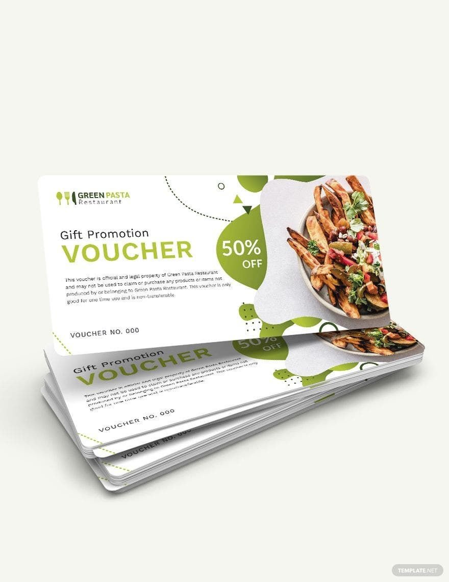
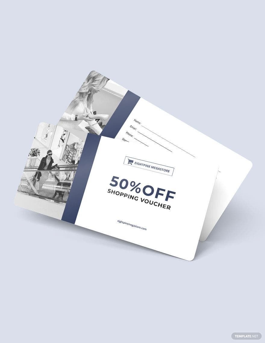
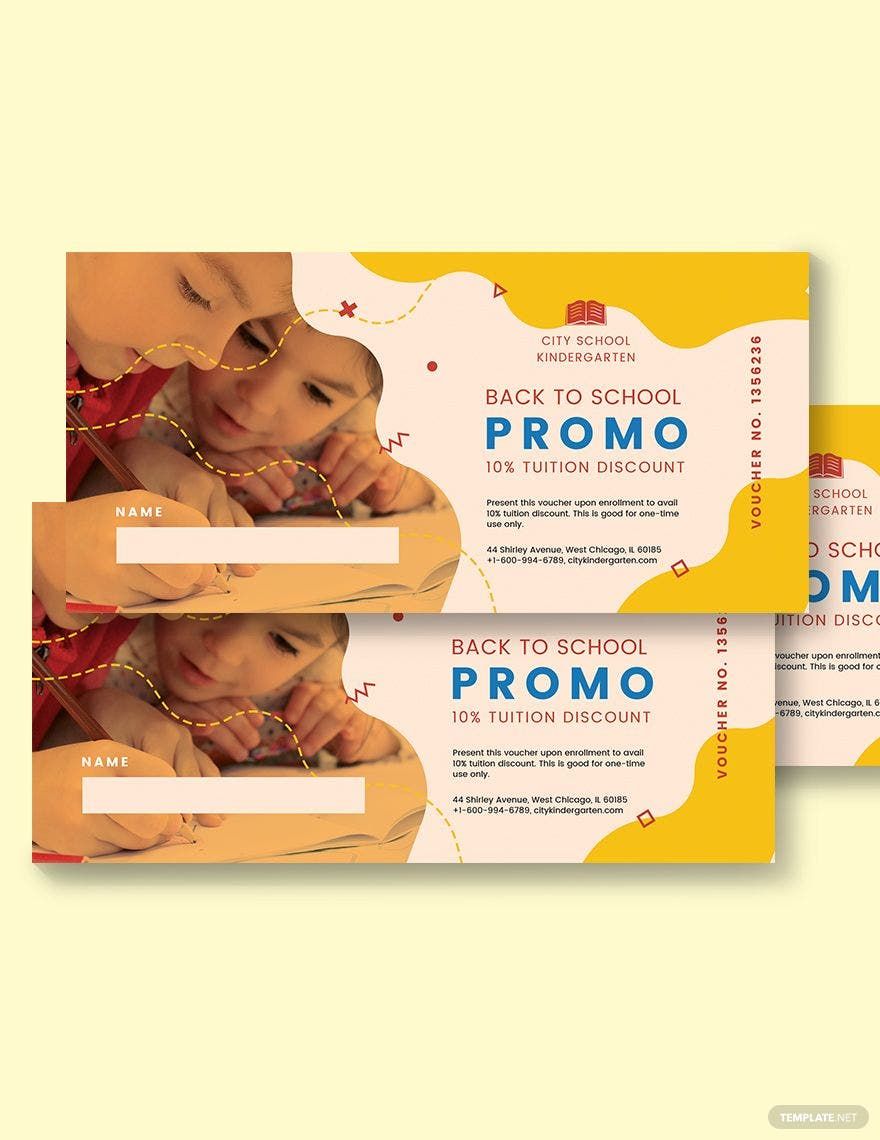
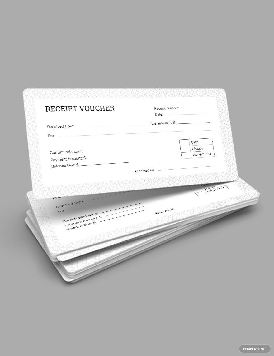
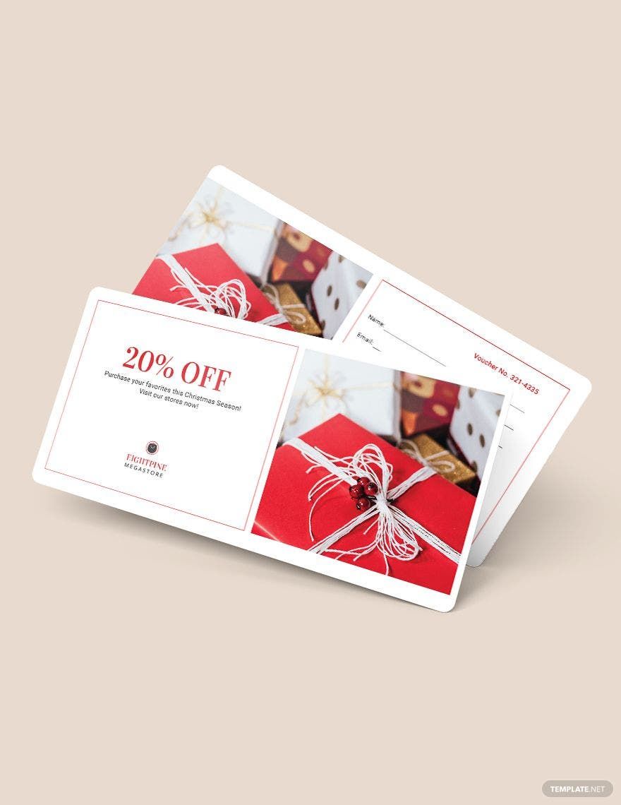
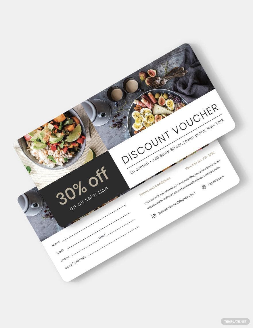
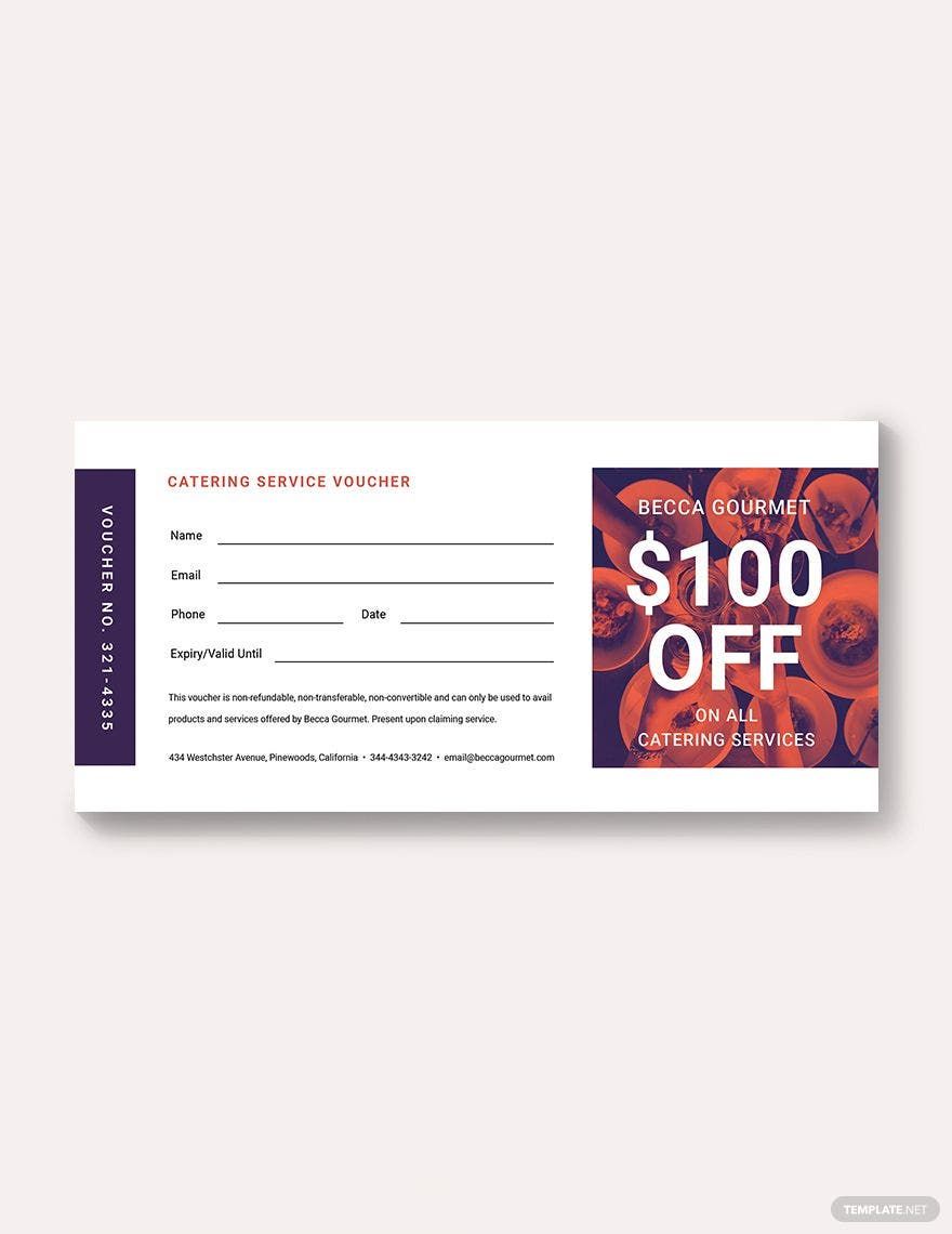
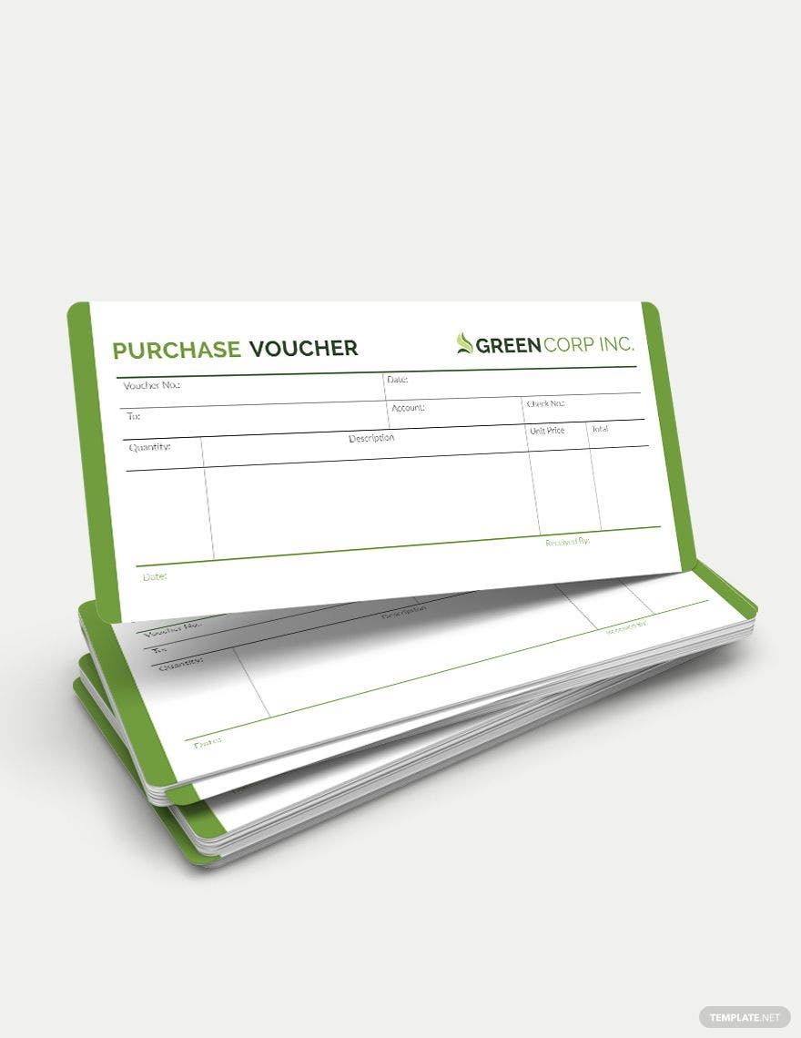
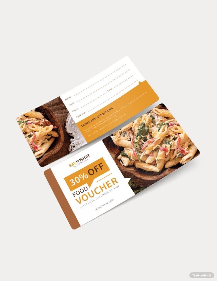
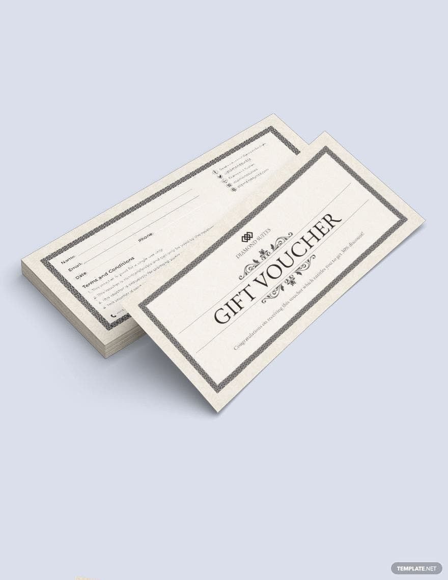
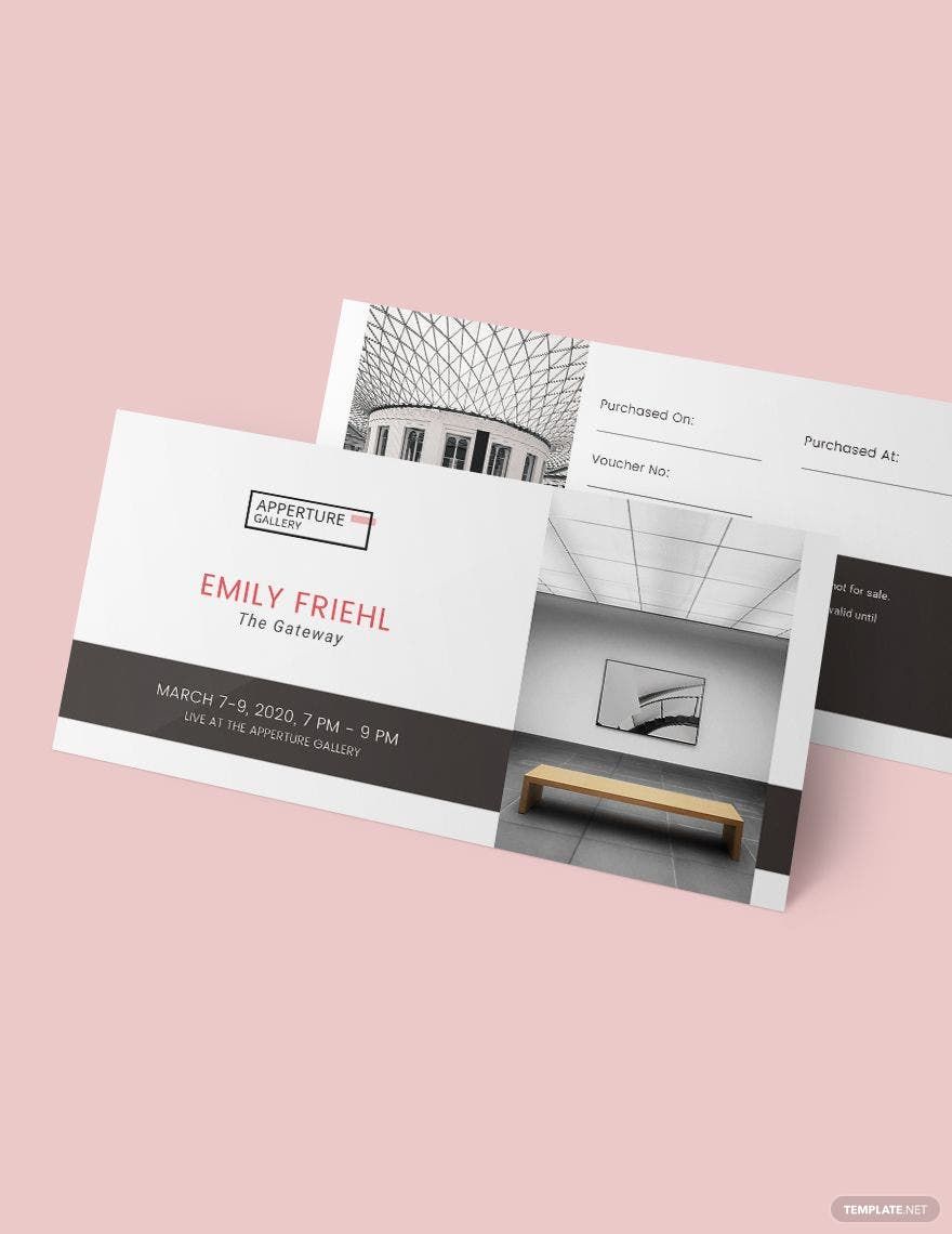
Keep your business lively, attract more customers, and enhance your brand presence with Simple Voucher Templates from Template.net. Perfect for businesses ranging from small retail shops to larger enterprises, you can achieve seamless marketing efforts that captivate your audience and increase sales. Whether you want to promote a sale with eye-catching discount vouchers or invite clients to a VIP event with exclusive access passes, these templates have you covered. Each template includes essential details like customizable time, date, and location fields, and you can even integrate a promotional code or QR code. Experience no skill barriers with our easy-to-use templates, offering professional-grade design elements that allow you to focus on what truly matters—engaging your audience. Enjoy the added benefits of customizable layouts suitable for both print and digital distribution.
Discover the many voucher templates we have on hand, designed to cater to diverse marketing needs. Selecting a template is a breeze—simply pick your preferred design, swap in your business's graphics, and tweak the colors and fonts to align with your brand identity. For those wanting to add a little extra flair, take advantage of features like drag-and-drop icons, graphics, and even animated effects to make your vouchers stand out. Our AI-powered text tools ensure your message is conveyed with precision and creativity, proving that the possibilities are endless and skill-free. Keep your marketing fresh with our regularly updated templates, as new designs are added weekly. When you’re finished crafting your perfect voucher, you'll have the flexibility to download or share it via multiple channels, including print, email, or export functions, making it the ideal solution for any business looking to streamline its promotional efforts.


