Aesthetic Narrative Report Layout
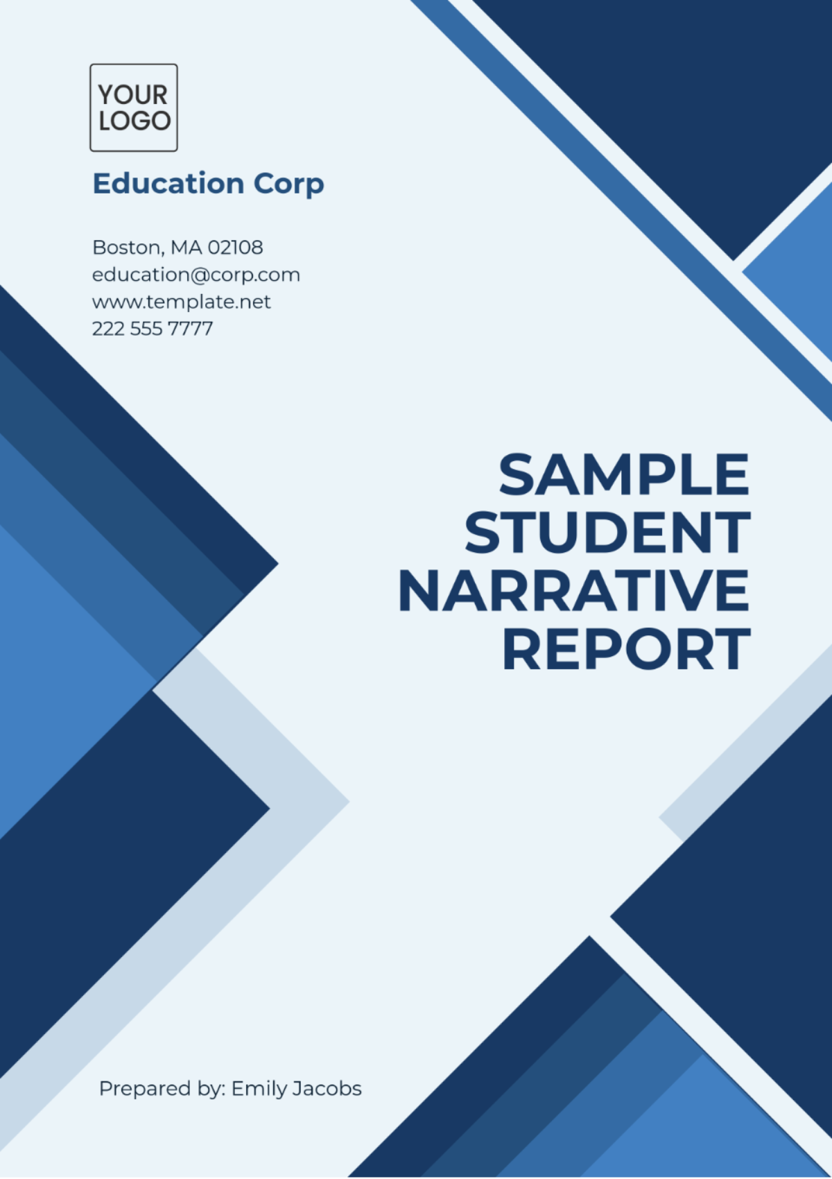
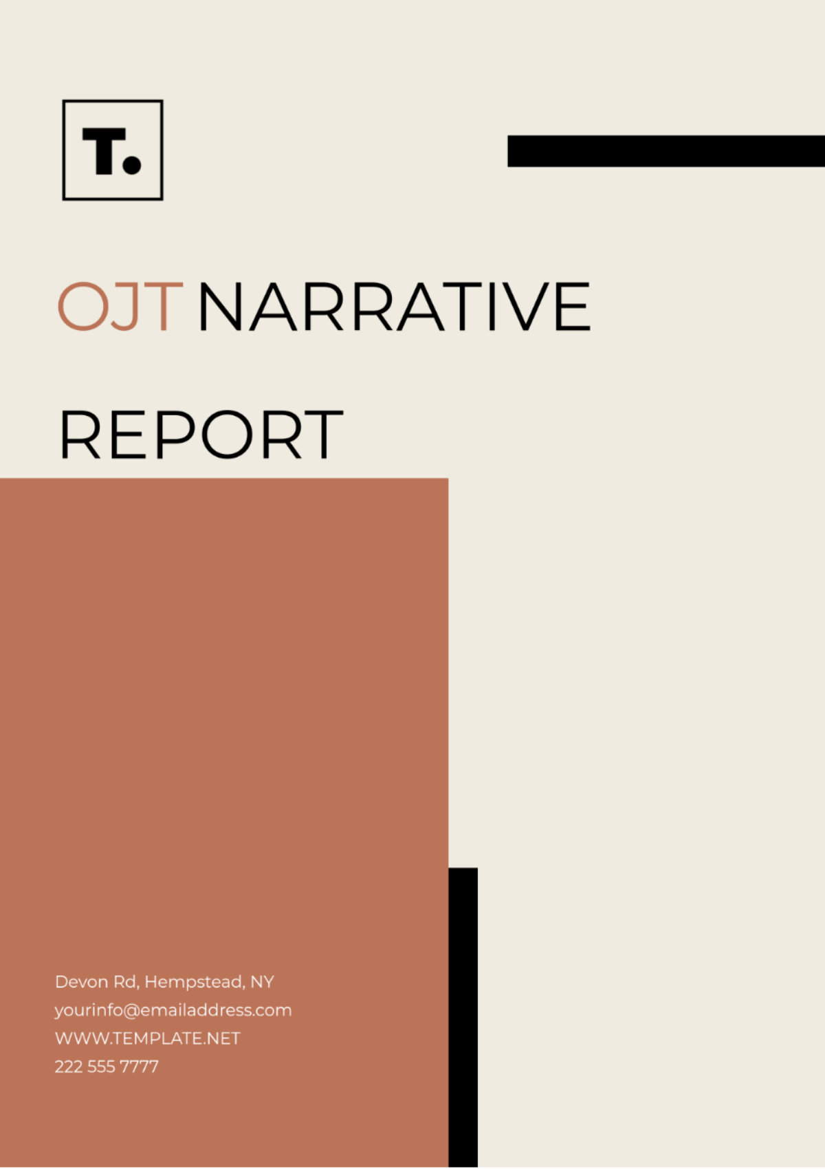
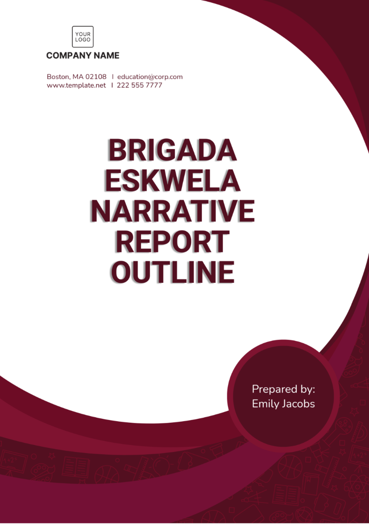
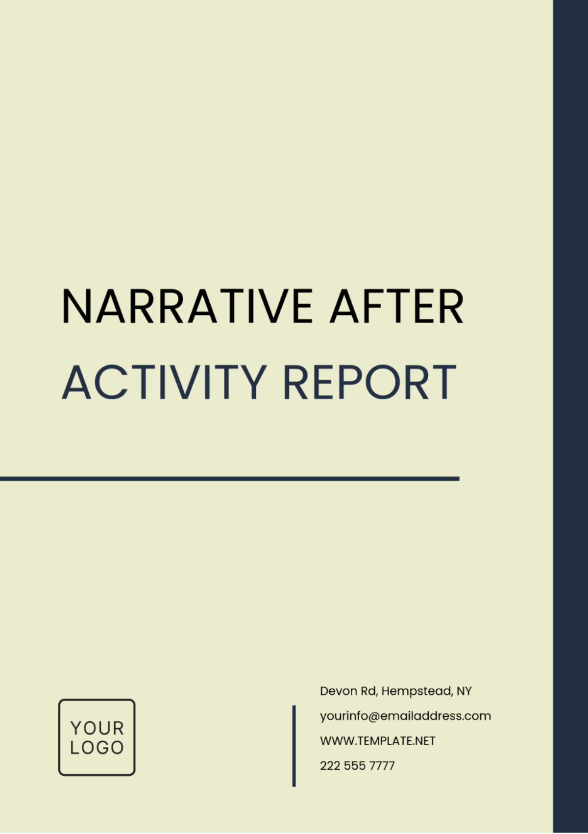
1. Cover Page
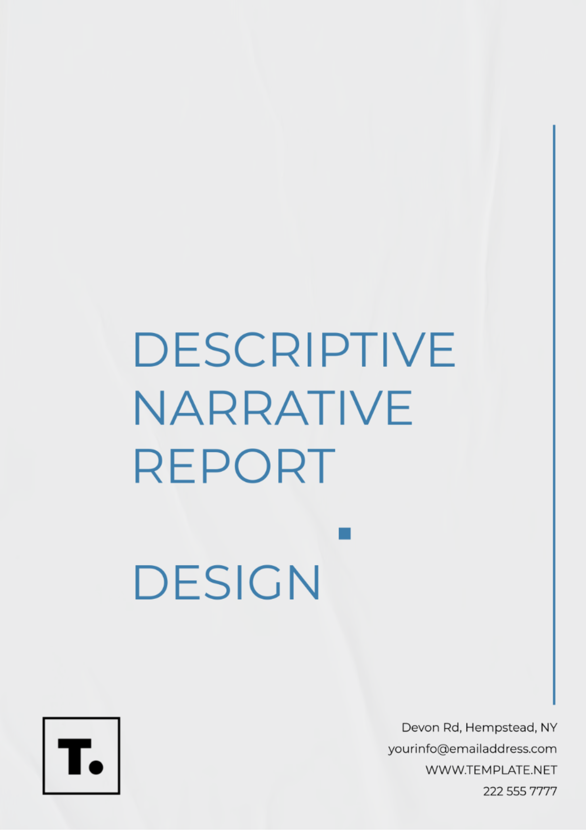
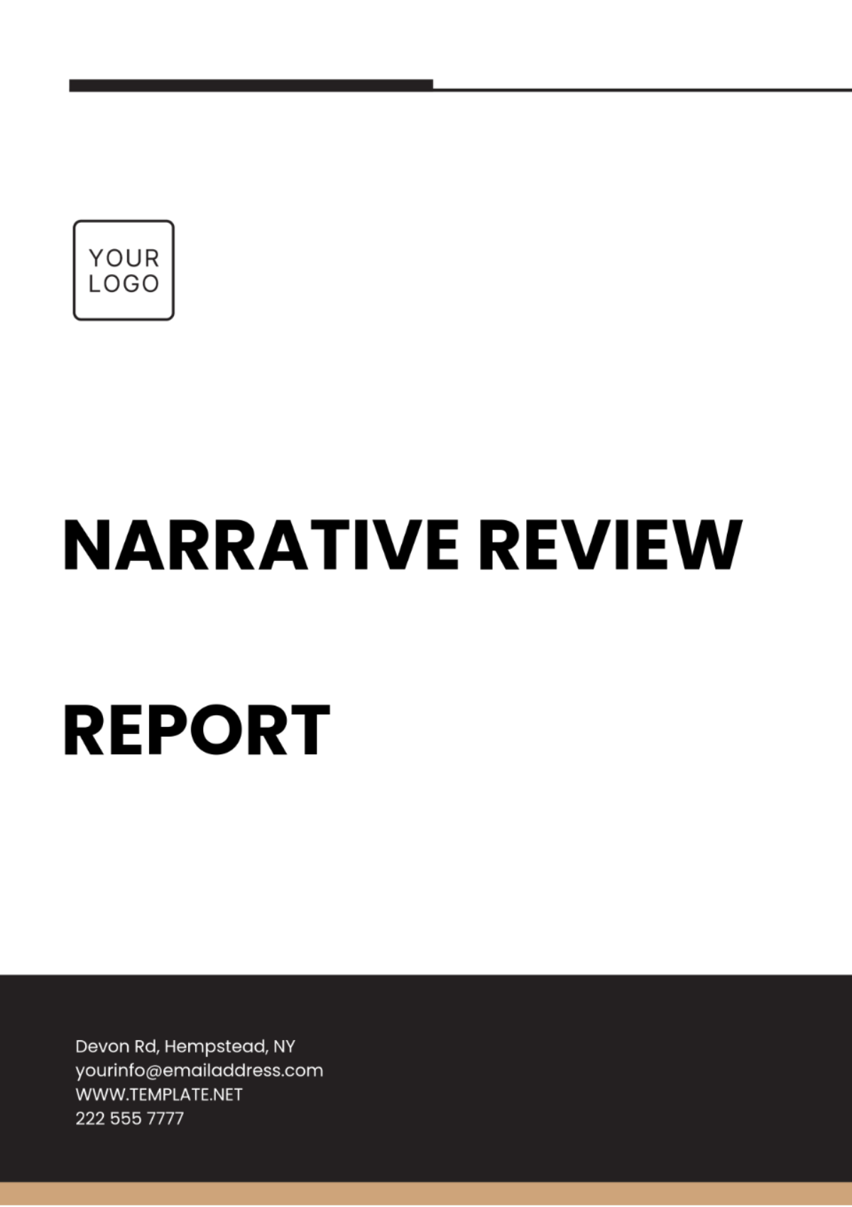
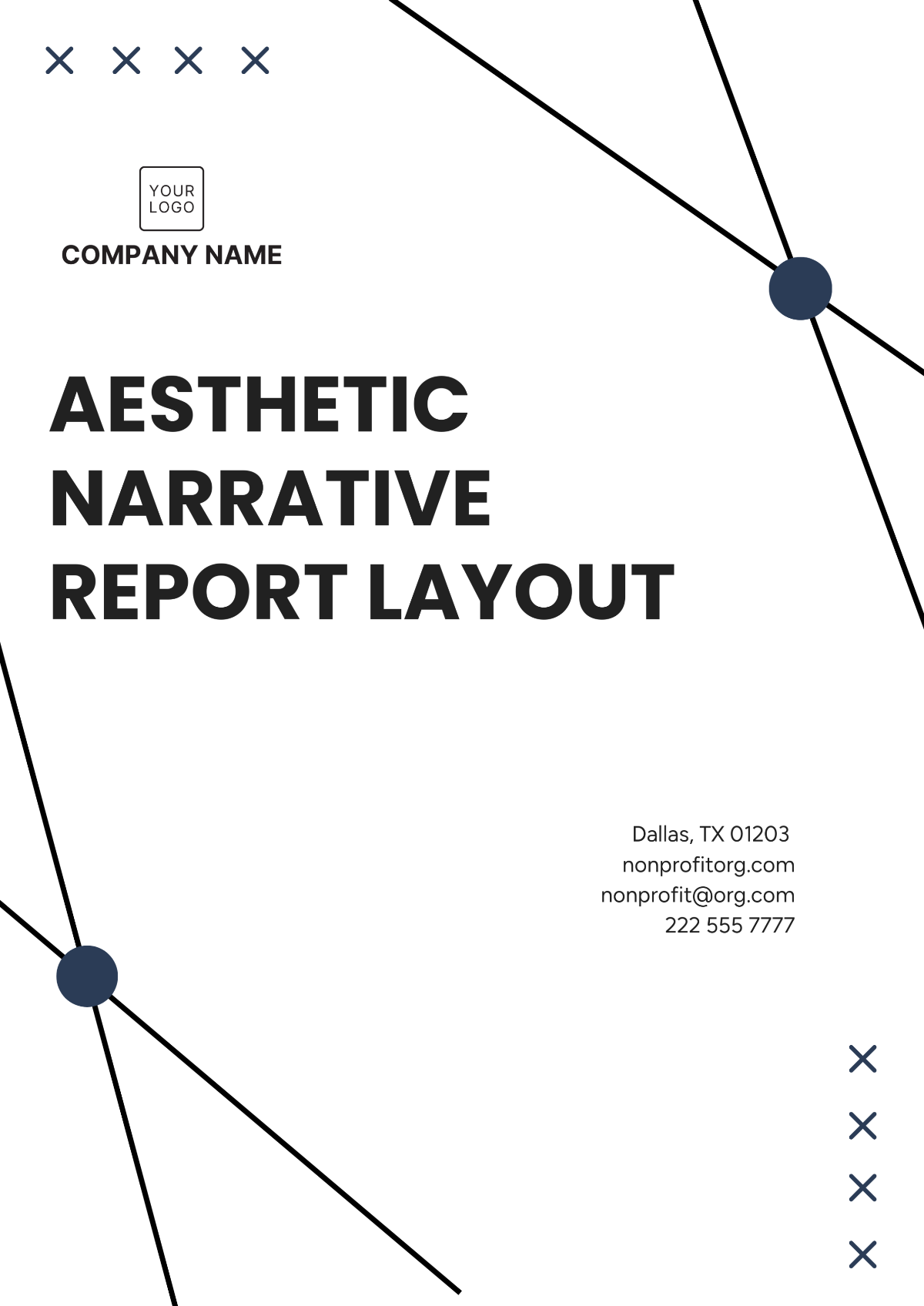
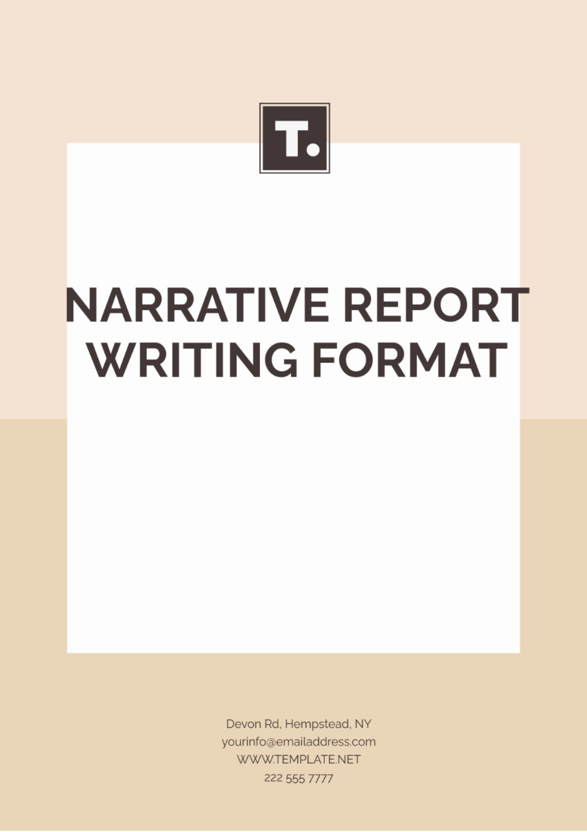
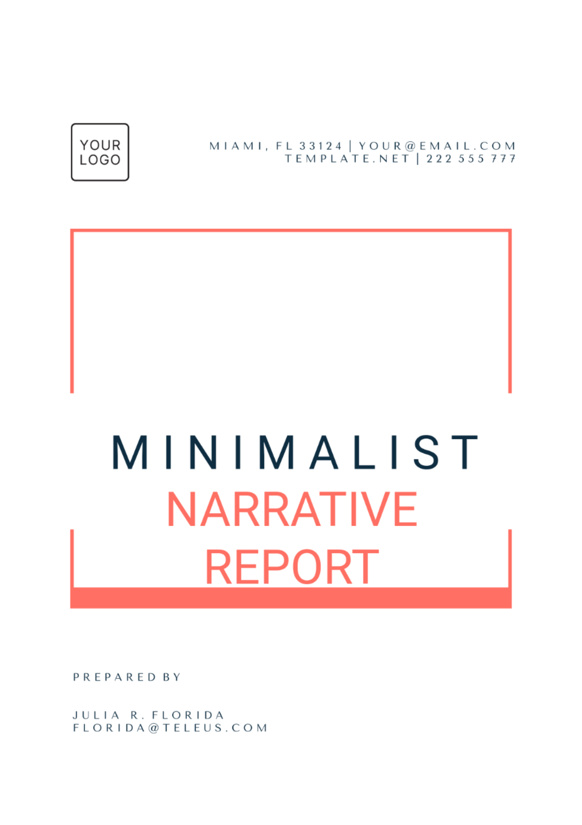
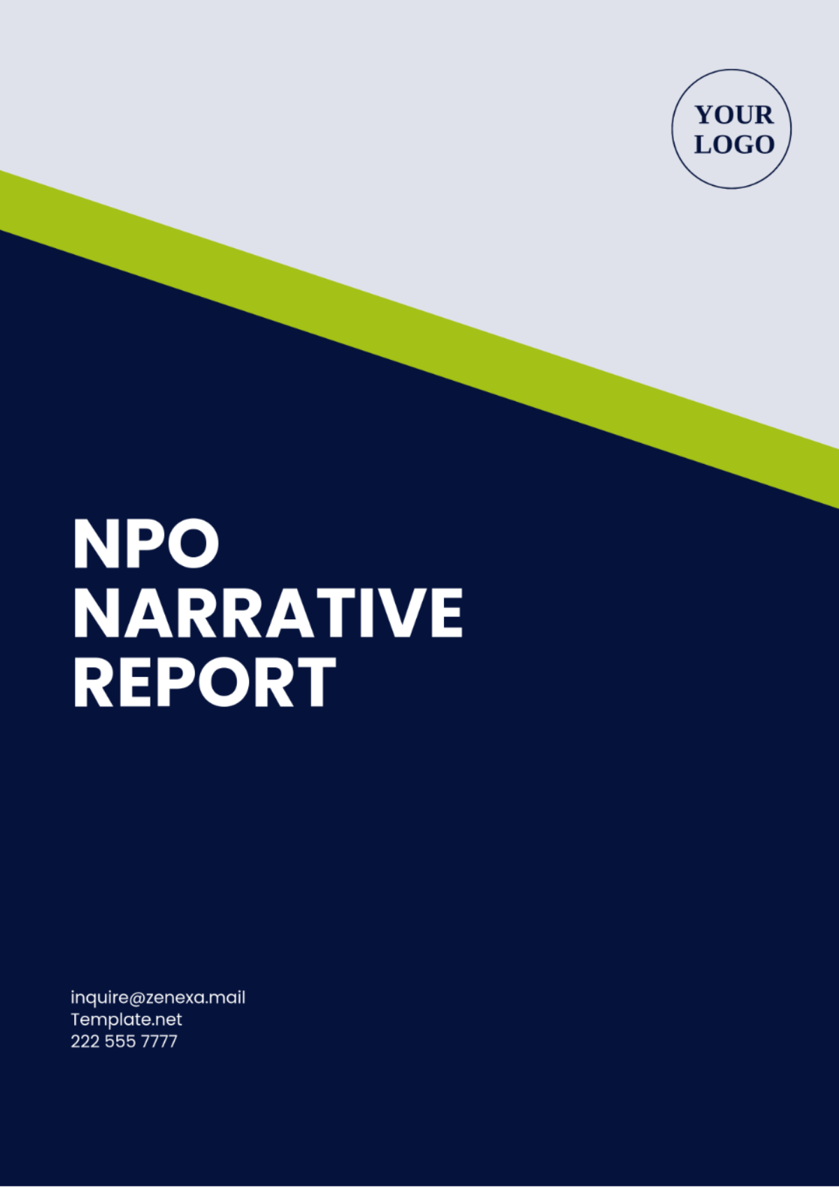
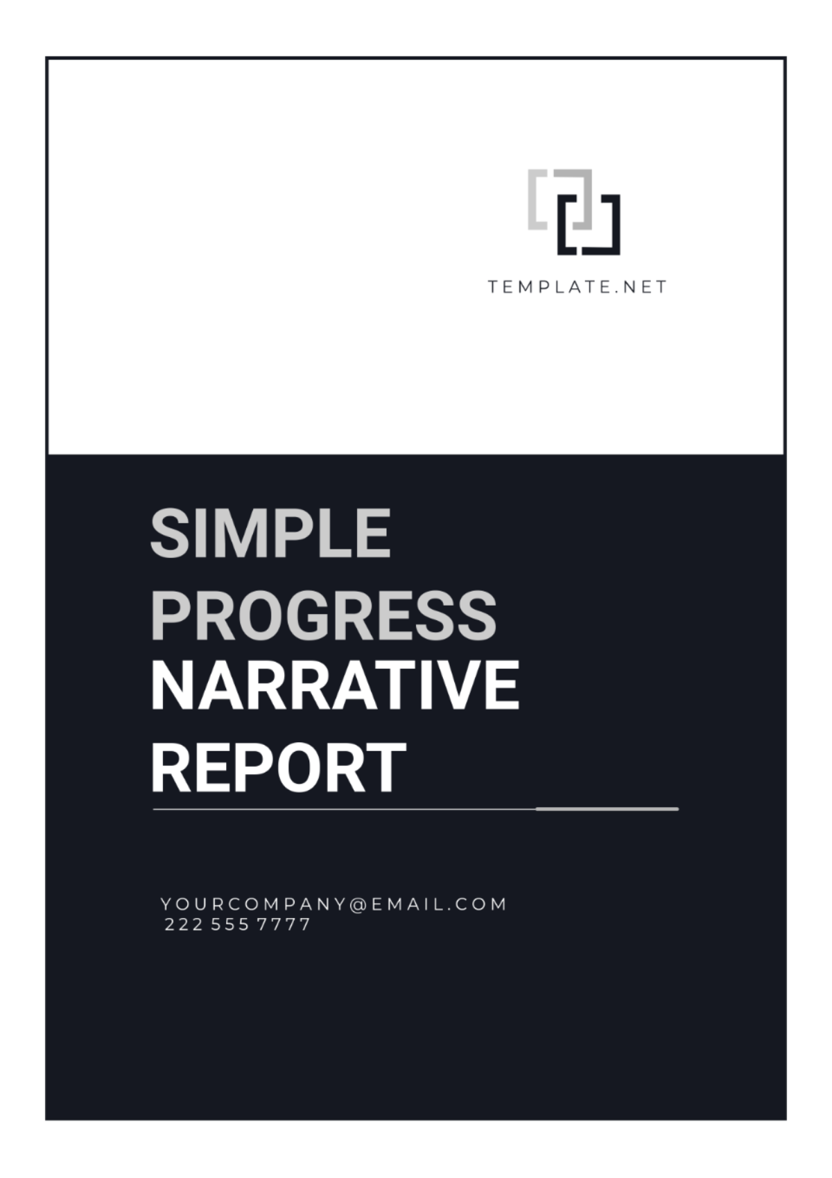
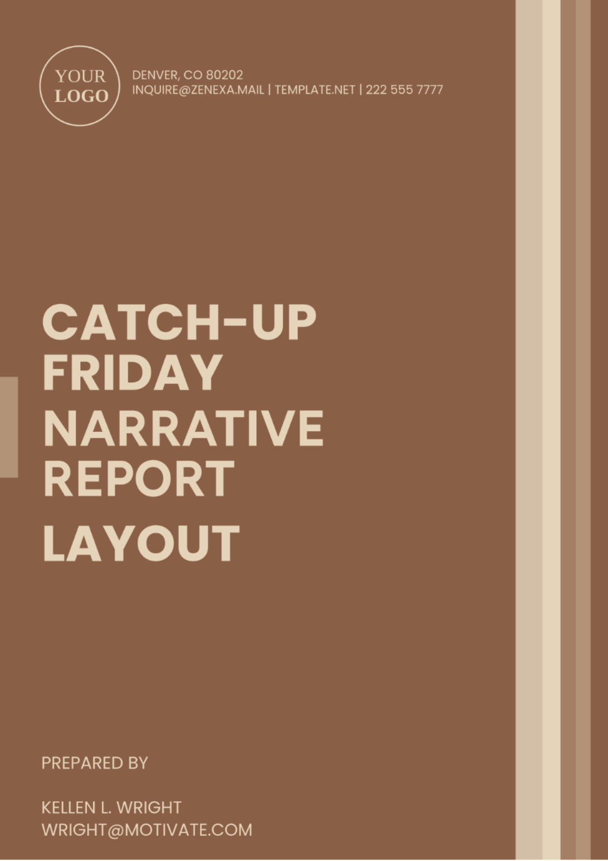
Title: Prominently displayed, using a modern, easy-to-read font. Use bold or larger text sizes.
Subtitle: Optional, placed beneath the title, concise and relevant.
Date: Year, starting from 2050 and beyond.
Author(s): Full names and designations or affiliations.
Visuals: Use high-quality imagery or a subtle, abstract design that ties to the theme.
Logo/Branding: If applicable, include clean, minimal branding aligned with the report’s theme.
Spacing: Adequate margin space and a balanced layout to avoid overcrowding.
2. Table of Contents
Font: Modern, legible font (e.g., sans-serif).
Headings and Sub-headings: Clearly differentiated by size and/or style (bold, italics).
Hierarchy: Main sections are larger and bolder, while sub-sections are smaller but still clear.
Alignment: Ensure proper alignment and space between entries for clarity and readability.
Optional Interactivity: For digital reports, make the Table of Contents clickable.
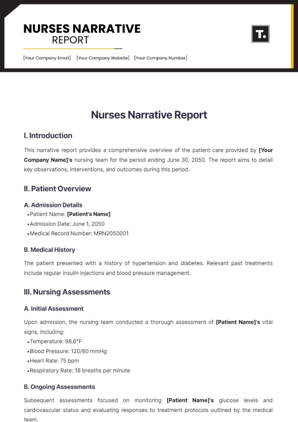
3. Introduction or Executive Summary
Font: Consistent with the body text (11pt or 12pt), easy-to-read.
Tone: Professional yet accessible, offering a clear overview of the report’s key points.
Visual Elements: Use minimal graphics or icons to enhance understanding without overwhelming the text.
Spacing: Adequate line spacing for easy reading.
4. Main Body Content
Section Dividers: Use subtle lines, background shading, or borders to separate sections.
Headings: Large and bold, with clear font distinctions.
Sub-headings: Smaller, non-bold font, distinct from body text.
Paragraph Structure: Keep paragraphs concise, ideally 3-5 sentences, to maintain reader engagement.
Typography: Stick to 2-3 fonts across the document to maintain consistency.
Spacing and Margins: Generous margins and space between sections to keep the layout clean.
Color Scheme: Muted tones or gradients, with complementary accent colors for headings or key data points.
5. Data and Visual Elements
Graphs and Charts: Modern, minimalistic design. Use complementary colors but avoid overly complex 3D effects.
Tables: Simple, clean tables with clear column headers and alternating row colors for better readability.
Icons and Diagrams: Utilize simple, intuitive icons or diagrams for key concepts. Avoid cluttering the page with too many visuals.
Infographics: Break down complex data into easy-to-understand visuals, ensuring clarity and simplicity.
6. Conclusion and Recommendations
Font Style: Use a slightly larger font for the conclusion to emphasize its importance.
Visual Highlights: Consider using a highlighted box or call-out section for key recommendations.
Bulleted Lists: If applicable, use bullet points to break down main conclusions or actionable steps.
Spacing: Keep enough space around the conclusion to ensure it stands out from the rest of the content.
7. Appendices and References
Appendices: Clearly labeled (e.g., Appendix A, Appendix B), with concise descriptions of their contents.
References: Maintain a consistent citation style (APA, Chicago, etc.), ensuring that all sources are properly attributed.
Formatting: Ensure clear separation between these sections and the main report. They should be easy to navigate.
8. Layout and Design Considerations
Consistent Formatting: Keep a consistent font, font size, and heading style throughout the report.
Use of White Space: Ensure there is sufficient white space around text, images, and charts to avoid a cluttered layout.
Background: Use clean, neutral backgrounds (white, light gray, or a subtle gradient) that don’t detract from the content.
Interactive Elements: For digital reports, ensure features like clickable tables of contents, embedded charts, and responsive layouts are incorporated.
9. Final Presentation
Page Numbers: Ensure page numbers are included, typically in the footer or top-right corner.
Header/Footer: Keep these simple with key information, such as the report title or company name.
File Format: For digital reports, ensure compatibility with various devices (PDF, HTML, etc.) and test for readability on all screen sizes.
