Root Cause Analysis Pareto Chart
Prepared By: [YOUR NAME]
Date: April 11, 2060
I. Introduction
The Root Cause Analysis Pareto Chart is a powerful graphical tool used to identify and prioritize the most significant factors contributing to a problem or issue. By identifying these key factors, organizations can focus their improvement efforts on the areas that will yield the most significant benefits. This analysis helps in visualizing the frequency of problems and determining which issues to address first based on their impact.
II. Understanding the Pareto Principle
The Pareto Principle, often referred to as the 80/20 rule, asserts that in many cases, roughly 80% of the effects come from 20% of the causes. When applied to problem-solving, this principle suggests that focusing on the most significant 20% of factors can resolve 80% of the problems. This principle underpins the use of the Pareto Chart in root cause analysis.
III. Components of a Pareto Chart
A. Bars Representing Frequency or Impact
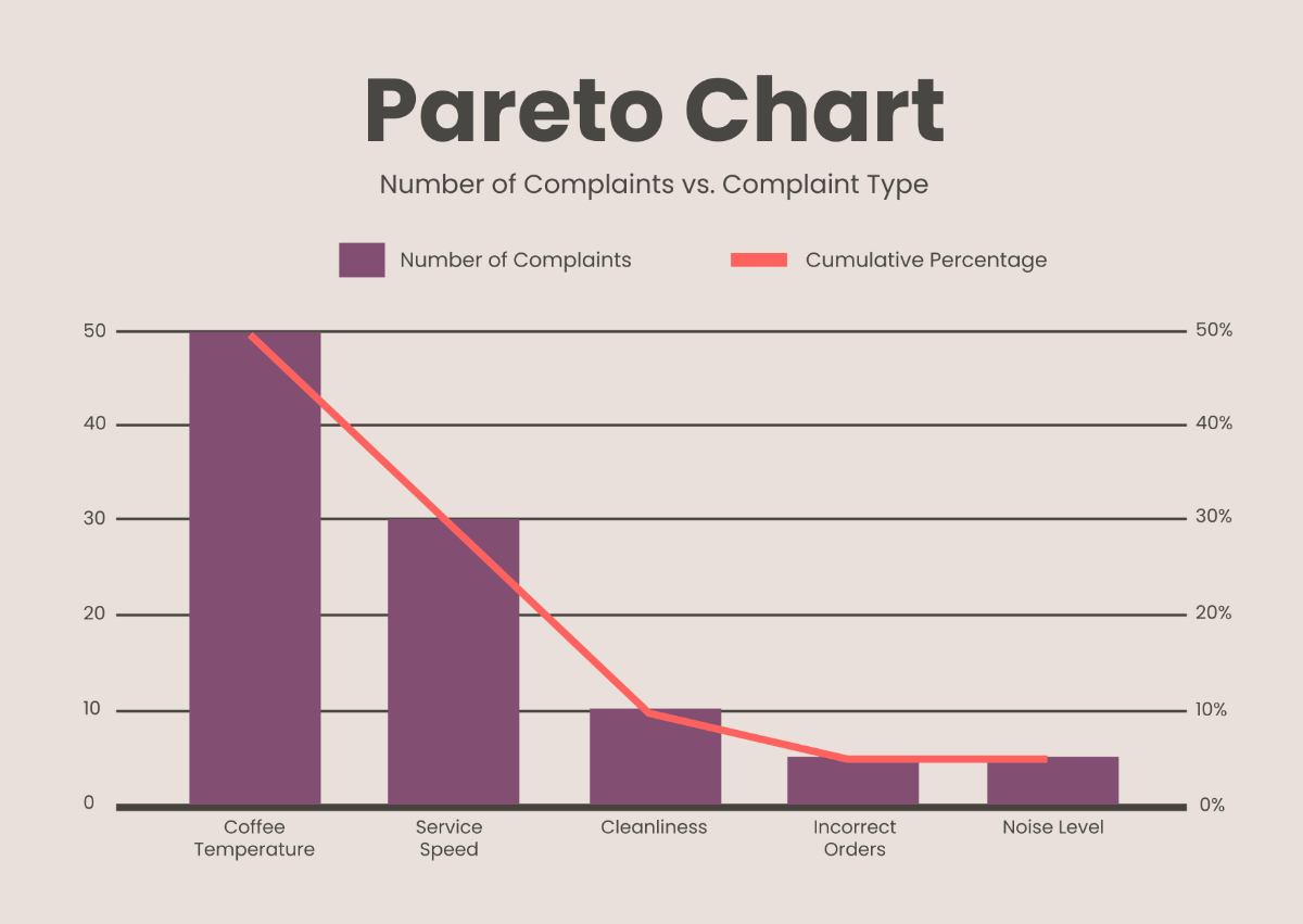
The primary component of a Pareto Chart is a set of bars that represent the frequency or impact of different factors. These bars are arranged in descending order, with the most significant factors on the left.
B. Cumulative Percentage Line
Another crucial element of a Pareto Chart is the cumulative percentage line. This line shows the cumulative percentage of the total impact as each factor is considered. It helps in visualizing how the different factors contribute to the overall issue.
IV. Creating a Pareto Chart
A. Step-by-Step Process
Identify the Problem: Clearly define the problem or issue that needs analysis.
Collect Data: Gather data on the frequency or impact of different factors contributing to the problem.
Categorize Factors: Group the factors into categories that will be represented on the chart.
Construct the Chart: Create the bars for each category and plot the cumulative percentage line.
Analyze the Chart: Identify the most significant factors contributing to the problem.
Implement Solutions: Focus improvement efforts on the most significant factors.
V. Case Study: Reducing Manufacturing Defects
A. Problem Identification
A manufacturing company is experiencing a high rate of defects in its production line. The goal is to identify the key factors contributing to these defects and prioritize corrective actions.
B. Data Collection
The following data was collected on different types of defects over a month:
Type of Defect | Frequency |
|---|---|
Misalignment | 40 |
Scratches | 30 |
Cracks | 20 |
Blemishes | 10 |
Other | 10 |
C. Pareto Chart Construction
The data is used to construct a Pareto Chart. Below are the steps and the resulting values for each defect type:
Type of Defect | Frequency | Cumulative Frequency | Cumulative Percentage |
|---|---|---|---|
Misalignment | 40 | 40 | 40% |
Scratches | 30 | 70 | 70% |
Cracks | 20 | 90 | 90% |
Blemishes | 10 | 100 | 100% |
Other | 10 | 110 | 110% |
VI. Analysis and Action Plan
The Pareto Chart reveals that 'Misalignment' and 'Scratches' are the most significant factors, contributing to 70% of the defects. Therefore, the company should prioritize addressing these two issues to achieve the most substantial reduction in defects.
Action Plan:
Misalignment: Investigate the root causes of misalignment and implement corrective actions such as machine calibrations and better alignment procedures.
Scratches: Review the handling process and introduce measures such as protective coverings or improved material handling techniques.
Monitor Results: Continuously monitor defect rates to measure the effectiveness of the implemented solutions.
VII. Conclusion
The Root Cause Analysis Pareto Chart is an invaluable tool for prioritizing corrective actions based on the significance of contributing factors. By focusing on the most impactful issues, organizations can achieve more effective and efficient problem resolution. This detailed guide underscores the importance of methodical data collection and analysis in driving sustainable improvements.
